Edition Details
Early in our relationship, Lisa and I were moving some bulky item out of my house. It wasn’t going well.
“We don’t know how to move together,” Lisa said.
It stung, at the time, but I realize, in hindsight, that it was true. In the three years we’ve been together there’s been a lot of figuring out how to sync our sometimes long-calcified rhythms: when do we get up in the morning? how do we spend our days? who will make the supper? where do the spoons go? what charities do we support? We are getting better at figuring these things out — better at “moving together” — and this box-making project has been an extra canvas on which to do that.
For me, creativity has always been something I escaped away to do: it was the respite from the everyday, not the everyday itself, and certainly not something I’d ever want to do with someone. That has changed withThis Box is for Good, which has been very much a collaboration between Lisa and me.
That said, Lisa, more often than not, has brought the creative inspiration for the box: it’s easy for me to think in words and letters (which was given life in our February box and our June box) but, unlike Lisa, who is an intensely visual thinker, things that aren’t letters don’t dance naturally in my head.
That began to change in 2017 when I started to learn to sketch. I wrote at the time:
I have long thought myself without talent for sketching, drawing, painting, and related arts because I was so abjectly unsuccessful at them during my public school years. I’m pretty sure that there was an implicit “we understand you have no talent, so just try your best” vibe from my public school art teachers that only reinforced this.
I had a lot to overcome, and it has taken the last 7 years of sketching to make me comfortable with the idea that I do have talent, that the visual world is as available to me as anyone else, and that, with practice, I can get better.
What I’ve sketch the most has been coffee cups. It’s a tricky shape. I often have my sketchbook — and time — while sitting in a coffee shop. It’s a good challenge. Here’s a selection of those sketches:
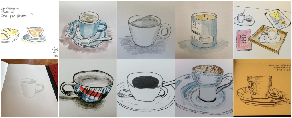
For the October box, we decided that creative direction would fall to me, while Lisa paid attention to the (many) other items associated with preparing a box for printing and distribution.
Given my sketching history, the first lino print I made, back when Lisa and I got our introduction to the medium from Maria Doering at a November 2023 workshop in Dartmouth, Nova Scotia, was of a coffee cup. It was rough around the edges, but making it taught me a lot about carving, and I learned how to print multiple colours.
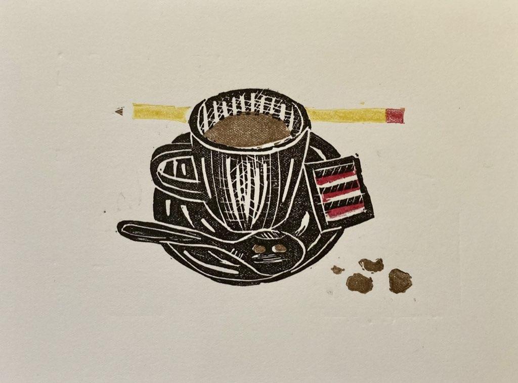
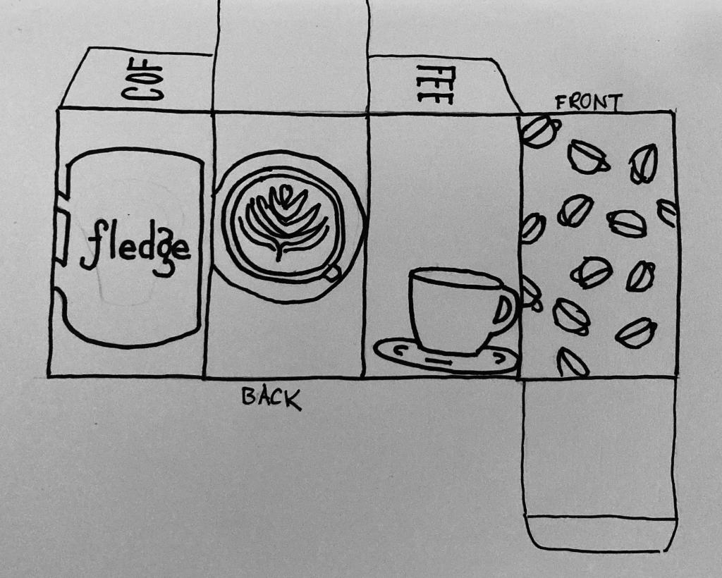
When the time came to choose a theme for our October 2024 box, I decided to return to the coffee well, and to design a box with a different coffee-related print on each of the four sides.
The box started life as a simple sketch in my notebook:
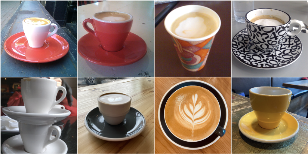
Over the years I’ve taken a lot of photos of coffee cups — my Photos app shows 461 results for a keyword “coffee cup” — and so I had a lot of helpful reference photos, including:
Whereas Lisa is much more of an “let’s draw and start carving!” person, I’m more of a “let’s make a proof of concept to explore the idea,” and so I started with a simple black and white sketch:
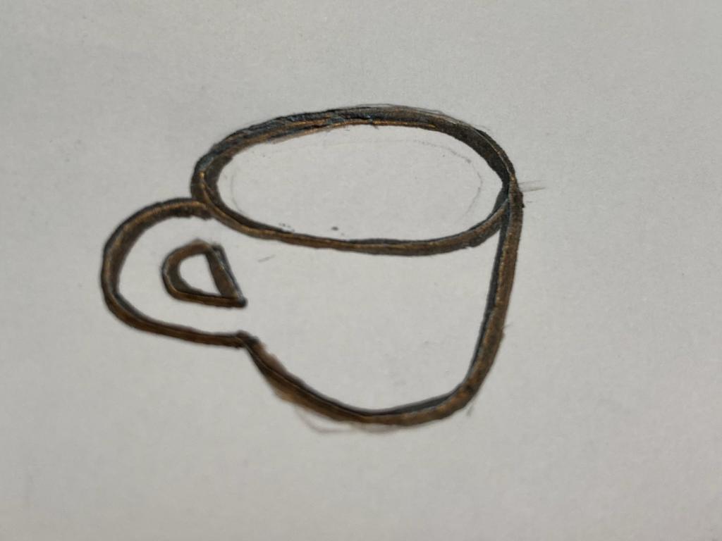
I transferred that sketch onto a piece of lino, using tracing paper and carbon paper, and then carved it:
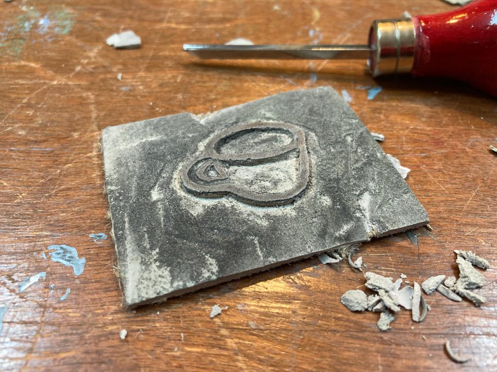
I then inked the small test block, and hand-stamped it onto the side of a scrap box:
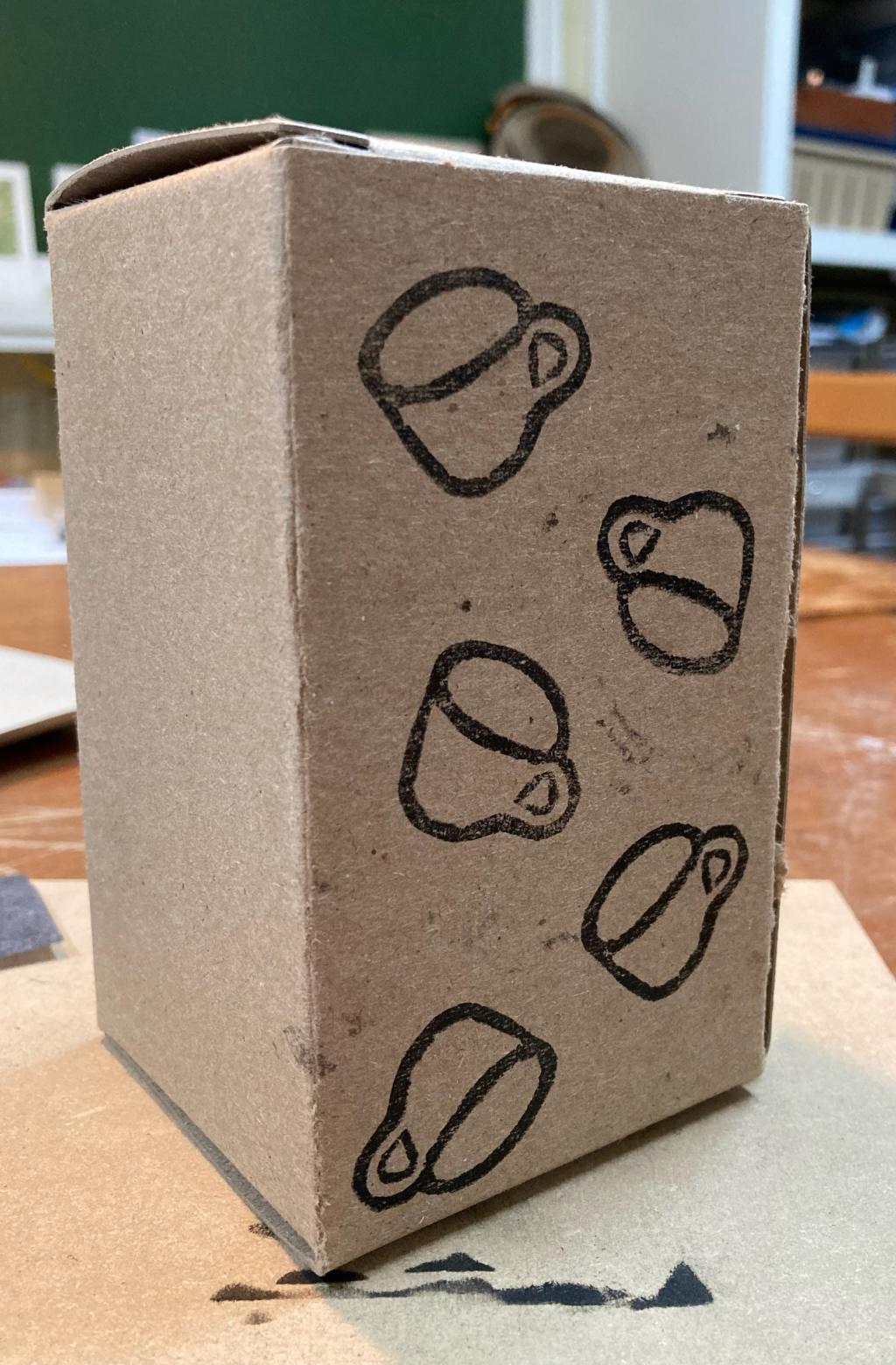
To simulate printing a white layer, I filled the cups in with white liquid paper:
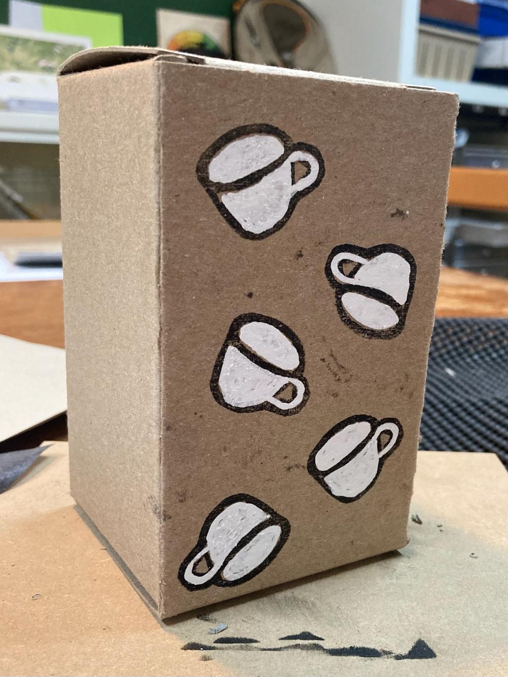
Lisa said, at this point, “there should be coffee in the mugs!”, and so I added it with a Sharpie:
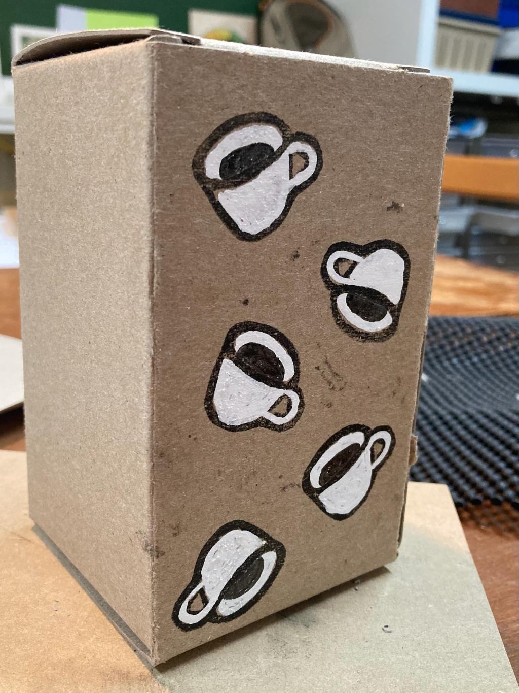
This is why I love the proof-of-concept: it allows for easy iteration; I loved where it started, and loved where it ended even better.
Confident that I was on the right track, I decided not to make proofs-of-concept for the remaining panels, and, instead, to dive right into the big carve.
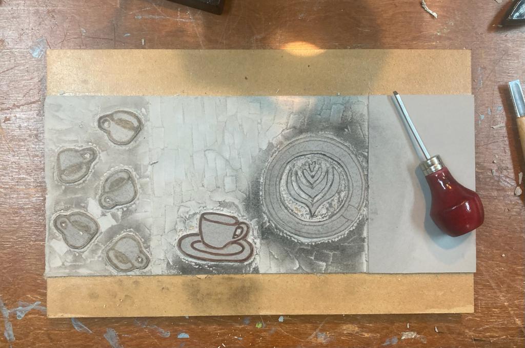
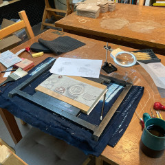
The final panel, the coffee mug with “fledgling” written inside, proved the most daunting prospect for me at this point, but I didn’t need to face that right away, as the first step was to print a layer of white on the boxes after carving the simple outline of the mug:
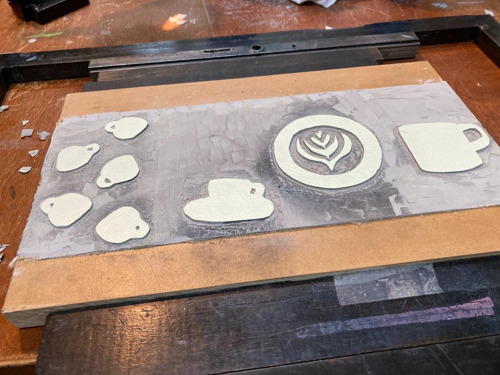
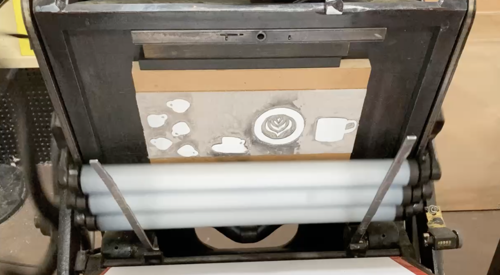
With sixty boxes printed with this white layer, the next step was to carve the block farther, removing any areas I wanted to stay white.
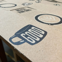
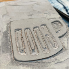
I solved the tricky “fledgling” carving problem by taking a suggestion from Lisa to instead carve the (much simpler) word “GOOD” on the mug:
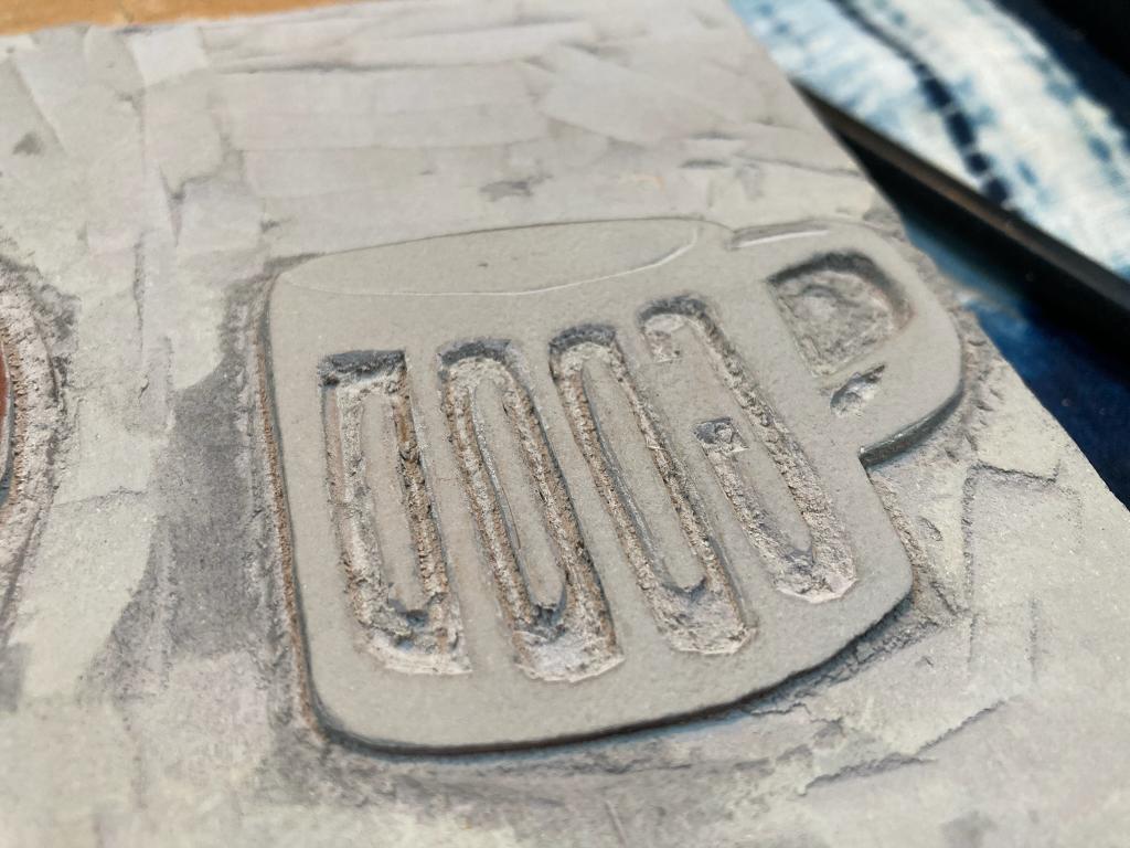
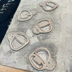
The others layers weren’t as tricky, but they still exercised my carving chops:
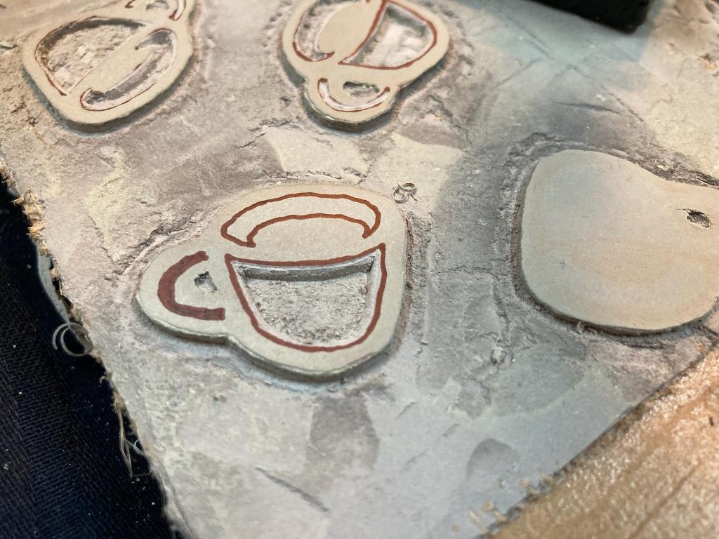
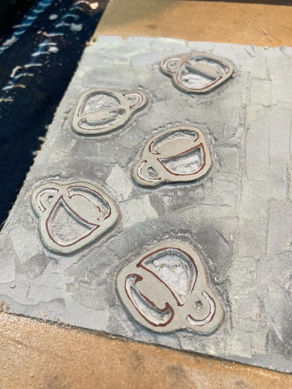
With the carving done, we printed the black layer:
The “GOOD” mug, which had proved daunting originally, ended up as a favourite of the four panels, and we leveraged that to turn it into a print of its own, using paper I inherited from Bill and Gertie Campbell when I originally acquired their letterpress many years ago:
We printed enough of these “coasters” to include one with every box we sent out.
Lisa, meanwhile, carved up the extras and mistakes into bookmarks (it turns out that this coffee box lends itself to being carved up like this):
In parallel to all of this, Lisa also took on the task of printing, cutting, binding, and colouring the updated zine we include in each box (she got helpful colouring assistance from my mother and my sister-in-law Karen this month):
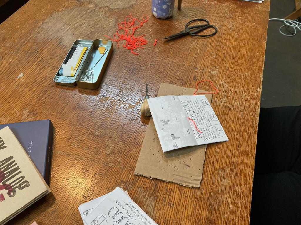
The zine seemed such a simple addition, in the abstract, when we decided to include it as part of the project back in June; when you add all the steps to produce it together, though, it takes a lot of time. It’s worth it as it does a good job (we think!) of explaining the project and guiding recipients, many of whom know nothing about our project at all, to pass their box along. But there are a lot of tiny Italian trees to colour in!
With the boxes printed, the bookmarks made, the zines ready, we were ready to assemble packages to go out around the world:
Boxes went out in later October to a mix of people who requested them, and our favourite coffee shops, from Oslo to Dublin.
Our distribution efforts were spurred on by a piece in Pressing Matters magazine, which resulted in more than a dozen requests for boxes, from Tideswell to New Plymouth.
Where This Box Has Been
18 boxes with 30 registrations across 24 unique locations:
| Box Number | Registrations | Journey |
|---|---|---|
| 1393 | 3 | London, United Kingdom → London, United Kingdom → West Wickham, United Kingdom |
| 1397 | 3 | Newington, United States → Storrs, United States → Storrs, United States |
| 1403 | 3 | Dartmouth, Canada → Bear Cove, Canada → Delta, Canada |
| 1386 | 2 | York, United Kingdom → Gateshead, United Kingdom |
| 1398 | 2 | Calgary, Canada → San Luis Obispo , United States |
| 1413 | 2 | Burlington, United States → Seattle, United States |
| 1414 | 2 | Rice Point , Canada → Halifax, Canada |
| 1425 | 2 | Charlottetown, Canada → Kitimat, Canada |
| 1427 | 2 | Charlottetown, Canada → Montague, Canada |
| 1379 | 1 | Tallinn, Estonia |
| 1380 | 1 | Helsinki, Finland |
| 1396 | 1 | Calgary, Canada |
| 1400 | 1 | Charlottetown, Canada |
| 1401 | 1 | Kitchener, Canada |
| 1402 | 1 | Tallinn, Estonia |
| 1410 | 1 | Støvring, Denmark |
| 1415 | 1 | Montreal, Canada |
| 1430 | 1 | Bristol, United Kingdom |

