Edition Details
Our inspiration for each monthly box varies. Sometimes there’s a clear vision, sometimes there’s a foggy notion, sometimes there’s no inspiration at all. Depending on where we’re starting, we’ll show up at the print shop ready to execute a clear plan, or ready to play, hoping for something to emerge. For June, we were playing.
The “foggy notion” we arrived with was “let’s explore negative space by overlaying shapes of different colours.” Our slightly-less-foggy plan was that we were going to carve shapes into a large 12 inch by 12 inch lino block, and then use the shapes, in different orientations and positions, and in different colours, to create an overlapping jungle of positive and negative space.
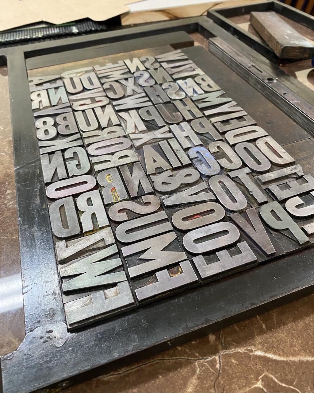
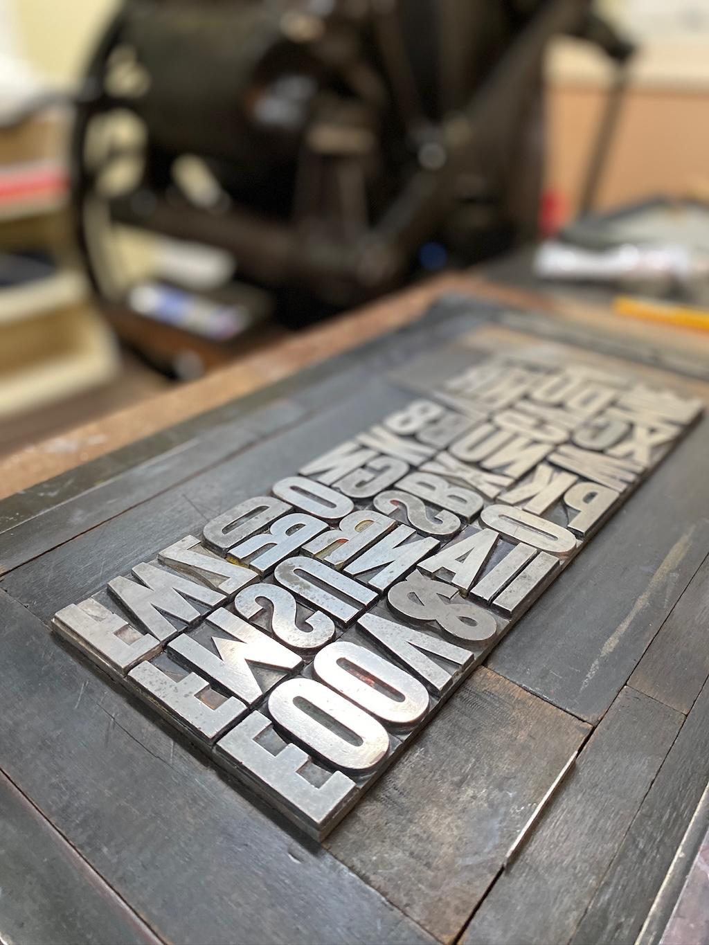
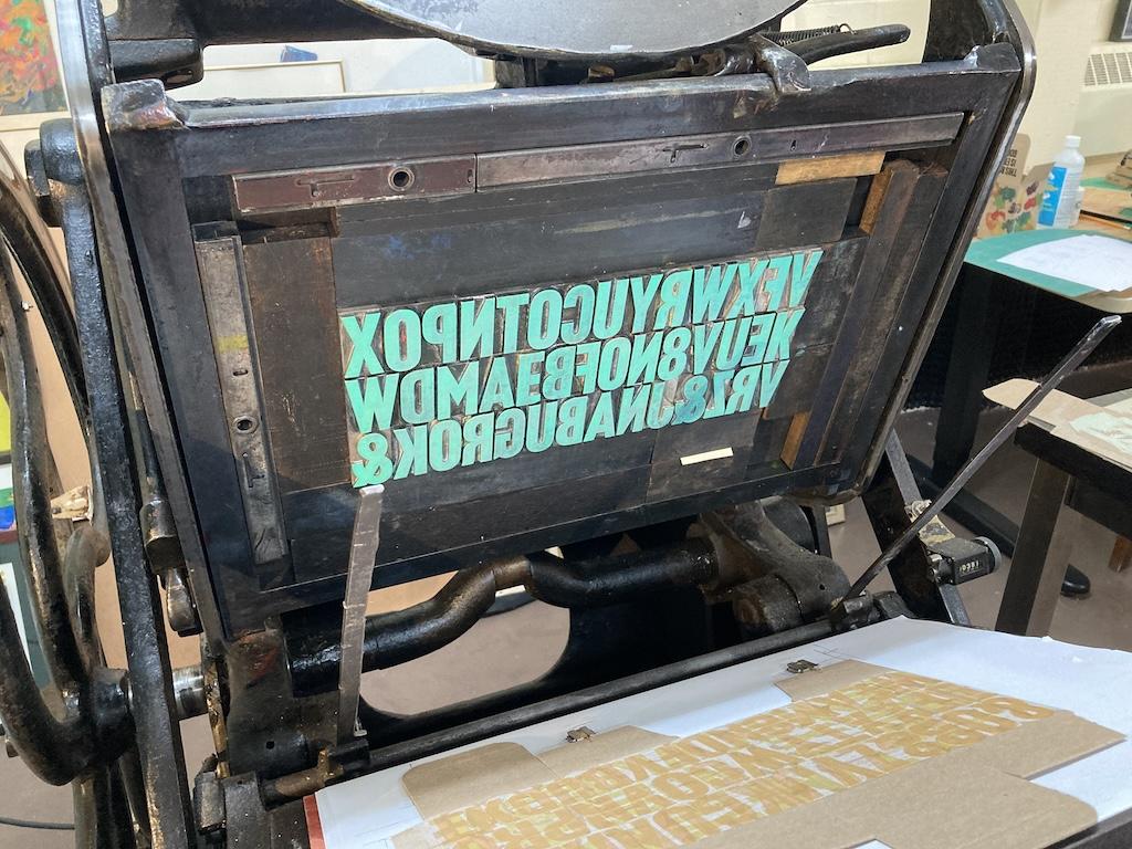
That plan lasted until we realized that a 12 inch by 12 inch lino block won’t fit in the chase of the letterpess. We could have worked around this, but we were primed for action (read: impatient), and so Lisa suggested, on the spur of the moment, that we take the same approach, but with metal type.
In this way this June edition of our box was our most improvisational and collaborative: as we experimented, we riffed on what we discovered, altered course, adjusted colour, flipped things upside down. The box truly emerged.
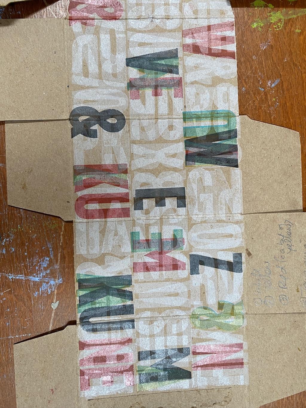
To give us something of a road map for the way ahead, we started by rolling out bands of colour, horizontally and vertically, overlapping at intersections, to see how different colours would relate and react to each other:
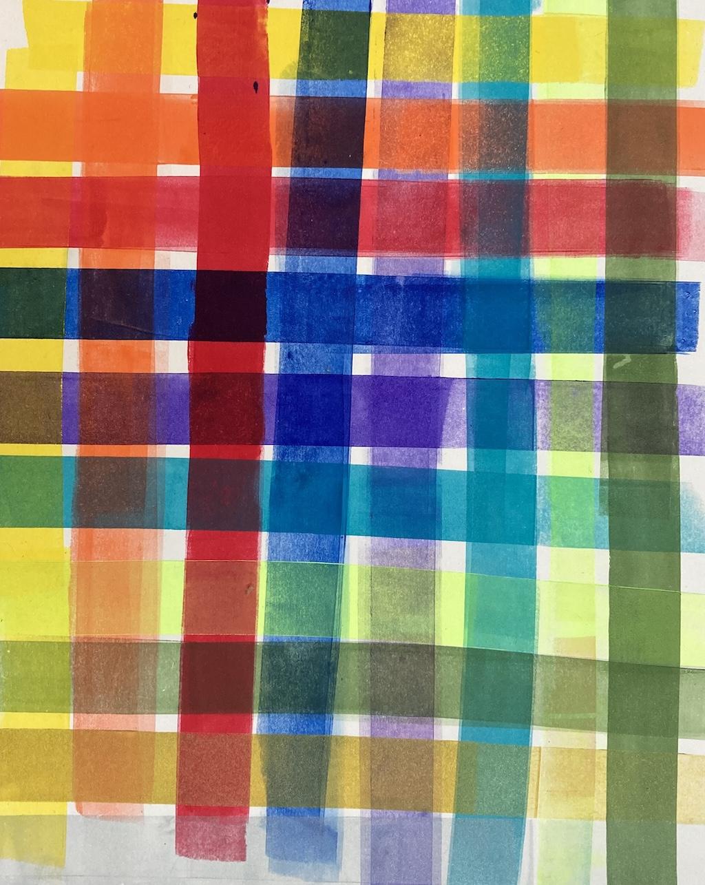
With that at the ready to consult as we proceeded, I set a box-sized grid of 120 point Akzidenz Grotesk in the chase of the letterpress—it took a bit of fussing and makeready, but less than I thought it might—and we started to experiment.

The Playing
And then, like I said, we played.
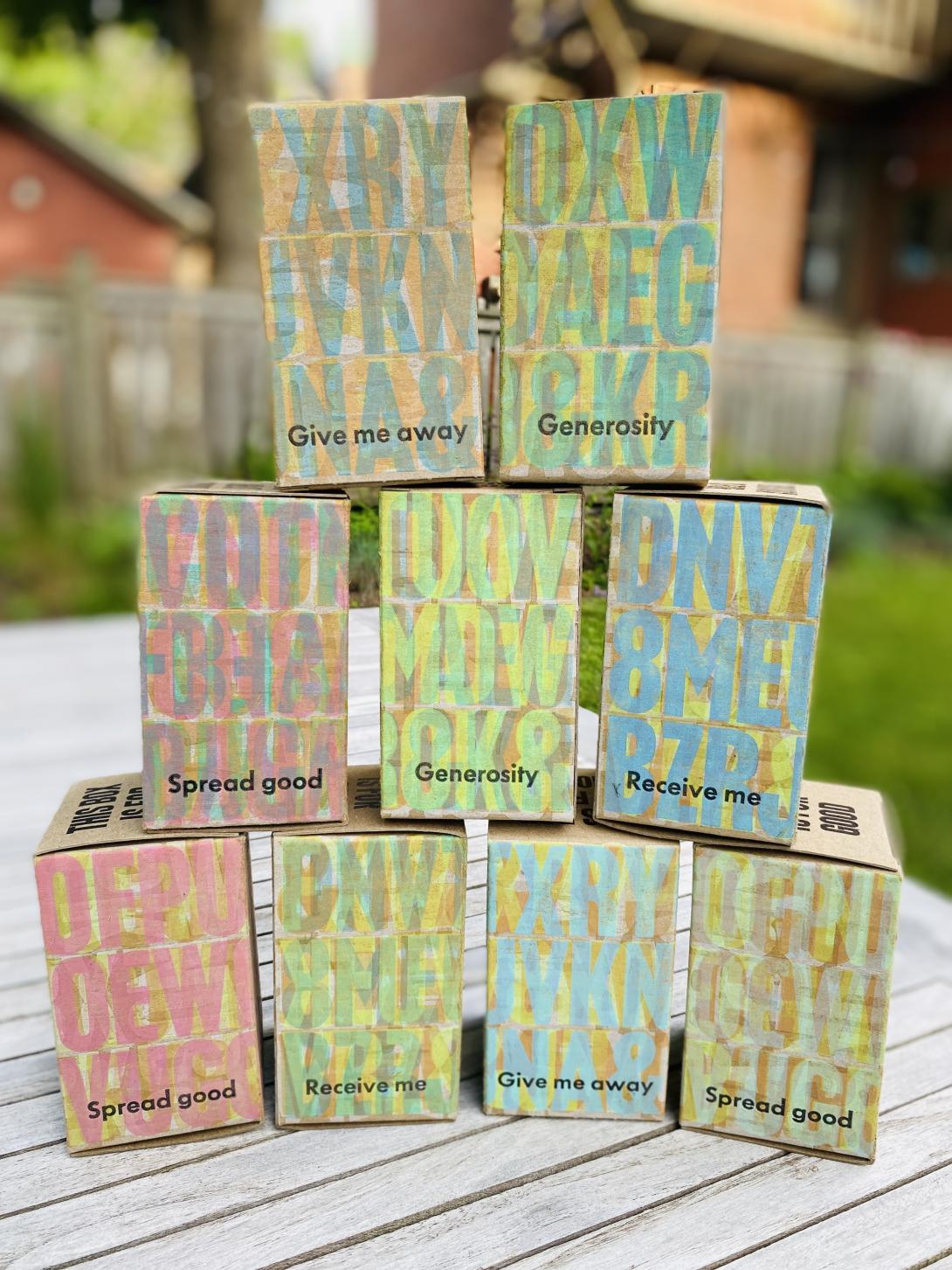
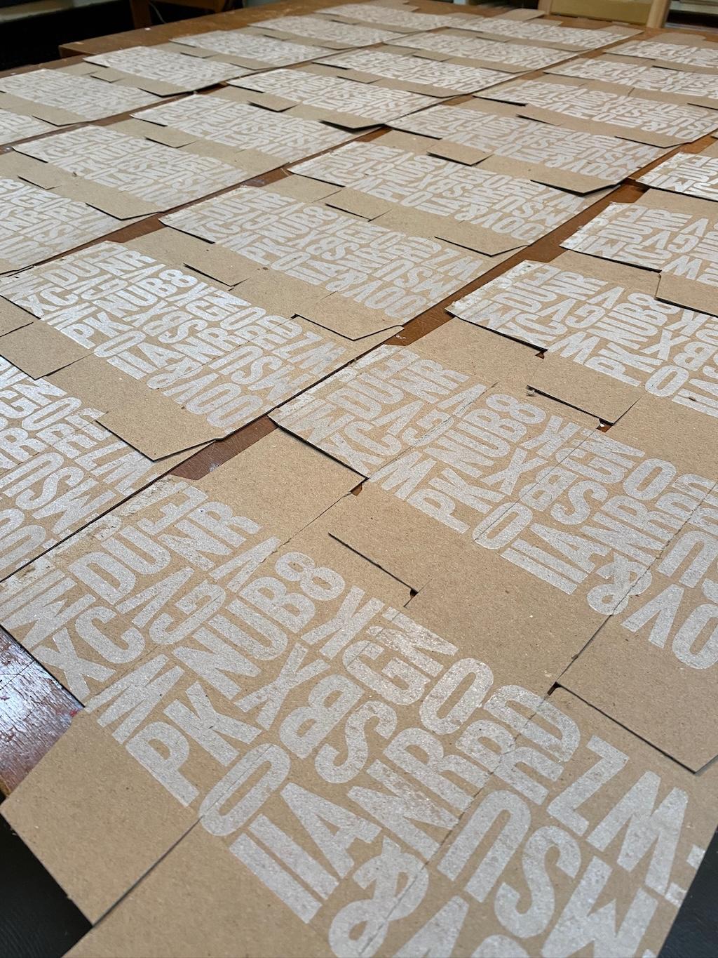
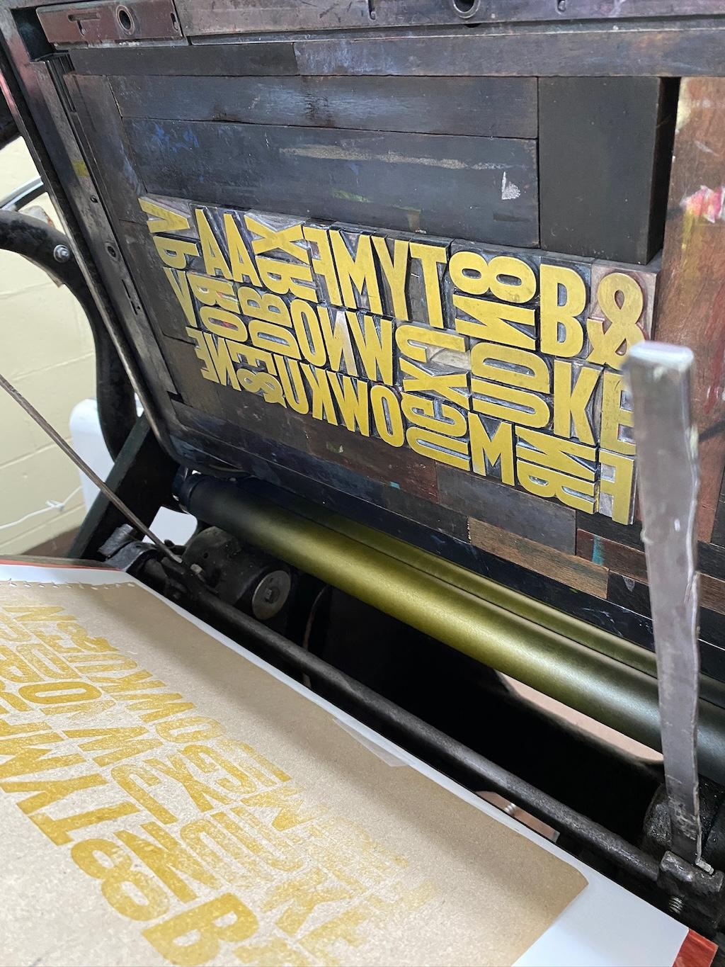
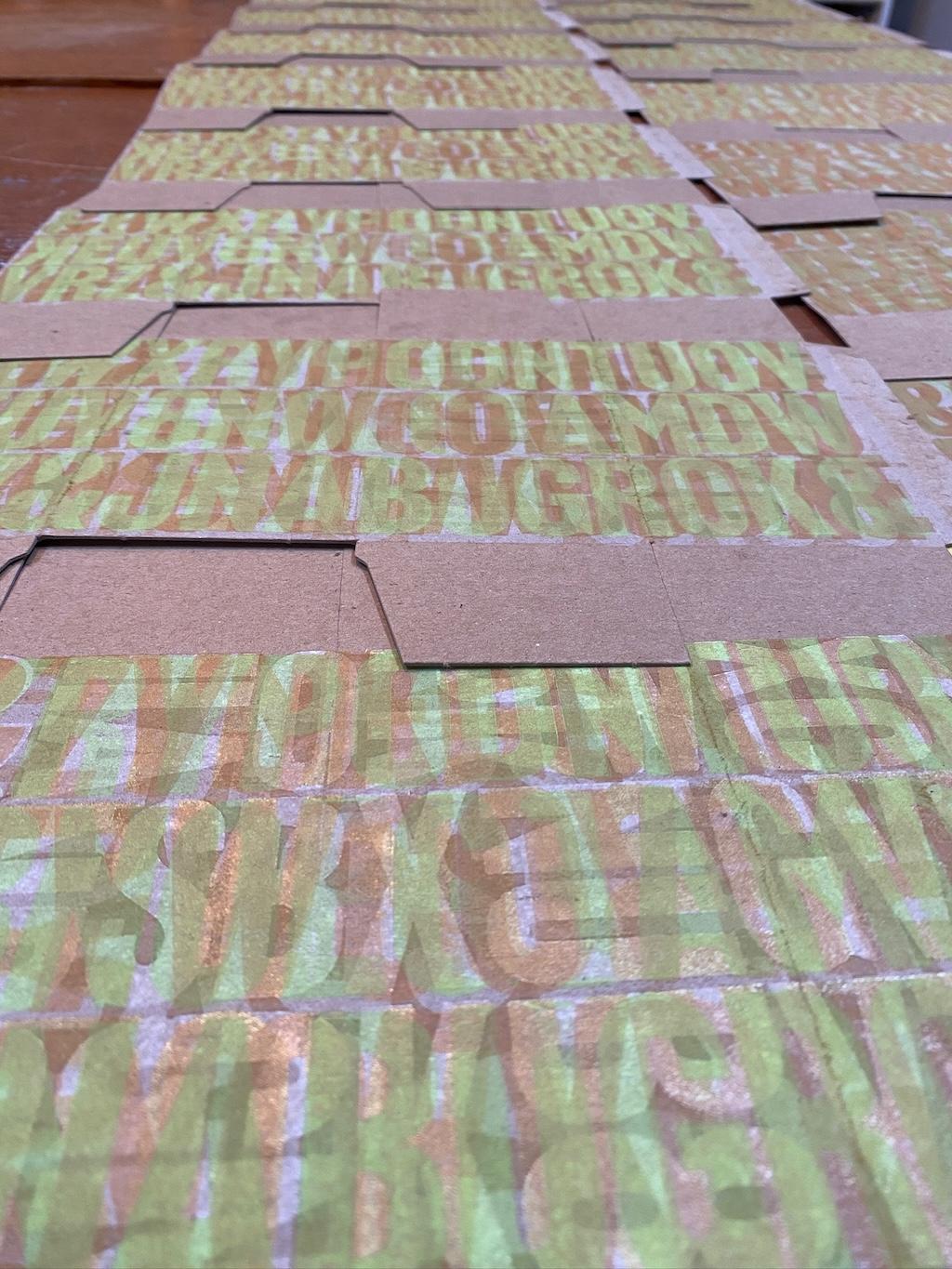
We rotated the box so that the type printed upside down. We reset the type, rearranging the letters and their orientations.

We layered colour upon colour, experimenting with different ink mixes, learning as we went.


What resulted could hardly be called an “edition,” as each box was different, but we achieved some interesting results, with some achieving a level of “are those letters? yes, they’re letters! or are they letters?” level of abstraction.
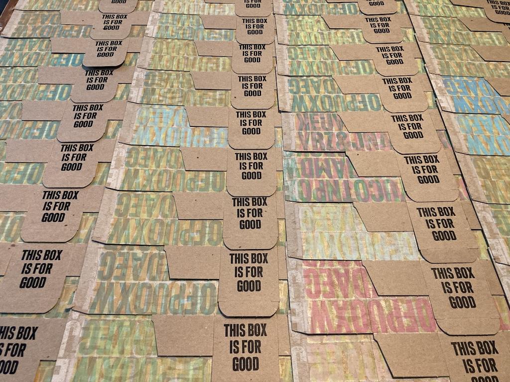
We did, as we’d hoped, in our starting foggy notion, explore colour and shapes.
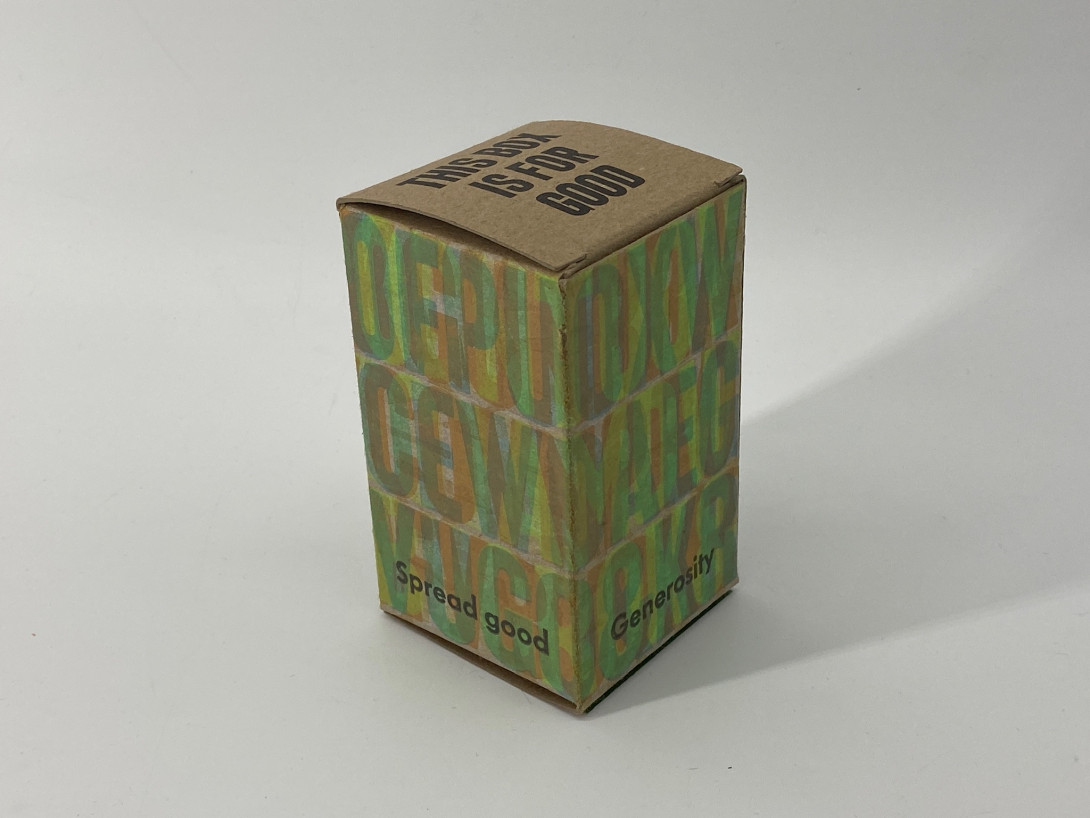
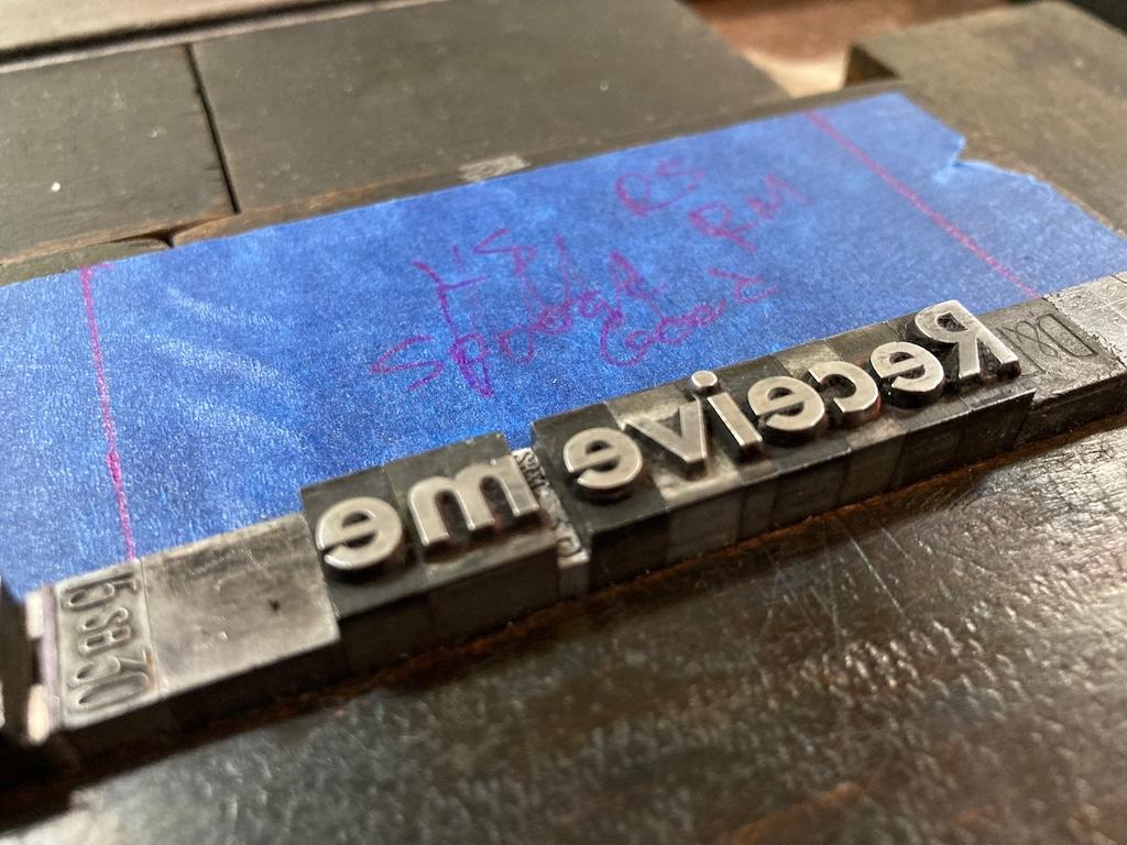
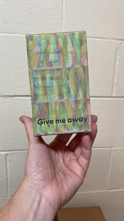
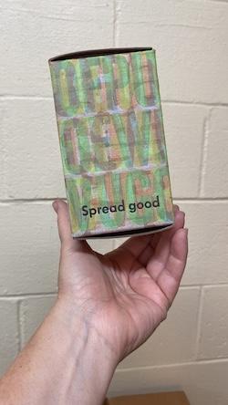
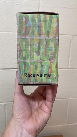
We had another foggy notion cum plan for the June box, and that was to use the box itself, and elements inside it, to encourage people to receive and then pass along the box.
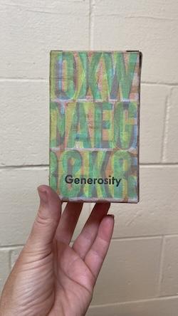
Step one in this drive was to print the phrases “Generosity,” “Receive me,” “Give me away,” “Spread good,” on the sides of the box in 24 point Futura Bold.
The Zine
The other part of our drive to encourage spreading was to prepare a “zine” that explained the history of the project, told some “box stories,” and provided a nudge to pass the box along.
By happenstance, both Lisa and I had just finished reading You Could Make This Place Beautiful, by Maggie Smith. The title of that book, and its central notion of the agency we have for improving our conditions, and those of us around then, seemed a fitting way to start the zine:
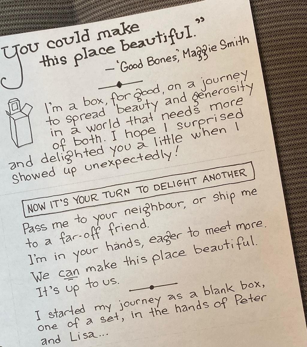
The zine was an entire production of its own, and you can read the zine online to see what we ended up with.
The Bookmarks
Finally, we needed to put something inside the box. We’ve had various levels of ambition and execution with the “inside” part: in December, before the project was really a “project” at all, we produced 200 bottles of spiced oil, Christmas candy, and hot mixed nuts; for February we included chocolates from Anne of Green Gables Chocolates. What we’ve realized in recent months is that our efforts are best spent on designing and creating and distributing boxes, and that we can leave the “pass it along with something neat” task to those we first pass the boxes to.
But, we didn’t want to leave these first recipients with nothing, so Lisa conjured the idea of taking some misprints and extras and turning them into bookmarks, leaving recipients with a keepsake.
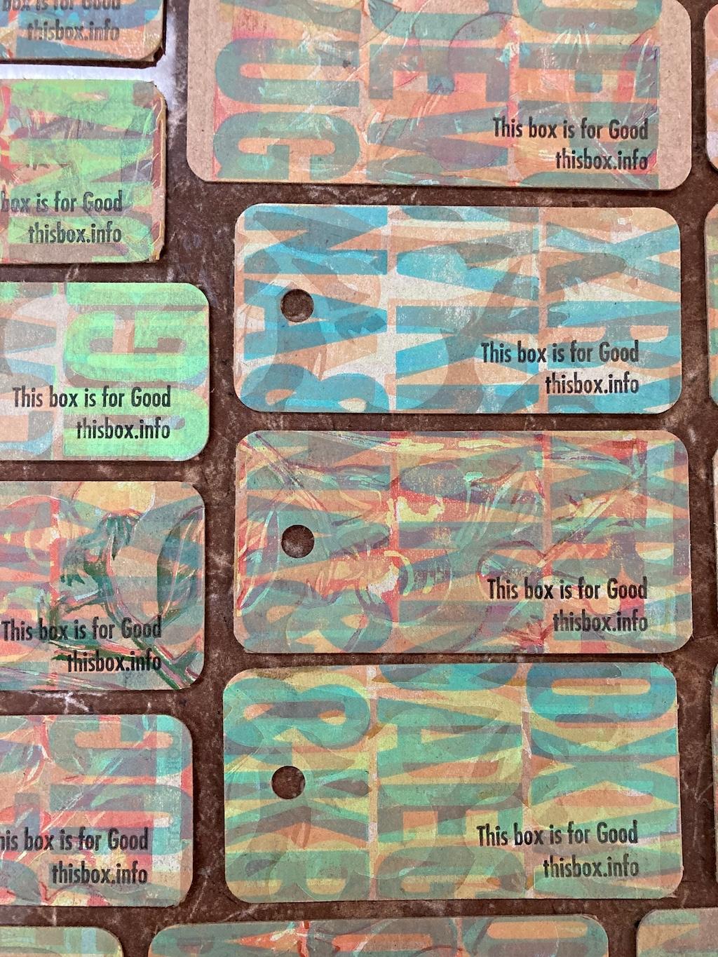
Of course making the bookmarks was another production all its own: cutting, bunching holes, adding strings, overprinting with the name of the project and the website’s URL.
The Assembly and Distribution
Once all the parts were printed, cut, glued, and assembled, we had great fun distributing the June boxes: we delivered one to a rural library, another to a north shore driftwood crafter, and yet another to our server at a Cardigan restaurant.
We also fulfilled the backlog of requests that came from the website (you can request a future box if you’re interested!).

Where This Box Has Been
18 boxes with 29 registrations across 22 unique locations:
| Box Number | Registrations | Journey |
|---|---|---|
| 738 | 5 | Clevedon, United Kingdom → Cologne, Germany → Guadalajara, Mexico → Uruapan, Mexico → Wien, Austria |
| 721 | 4 | Charlottetown, Canada → Halifax, Canada → Corner Brook, Canada → Onanole, Canada |
| 703 | 2 | Oyster Bed Bridge, Canada → South Melville, Canada |
| 708 | 2 | Charlottetown, Canada → Charlottetown, Canada |
| 734 | 2 | Powell River, Canada → Qathet, Canada |
| 735 | 2 | Charlottetown, Canada → Charlottetown, Canada |
| 704 | 1 | Stratford, Canada |
| 705 | 1 | Ebenezer, Canada |
| 706 | 1 | Stratford, Canada |
| 710 | 1 | Ottawa, Canada |
| 715 | 1 | Ardmore, United States |
| 719 | 1 | Balanite, Bulgaria |
| 725 | 1 | Aurora, Canada |
| 727 | 1 | Kingston, Canada |
| 729 | 1 | Picton, Canada |
| 730 | 1 | Lady Fane, Canada |
| 736 | 1 | Charlottetown, Canada |
| 737 | 1 | Charlottetown, Canada |