Edition Details
Lisa grew up in the village of Southport, across the harbour from Charlottetown, a village that’s now, along with a bunch of surrounding communities, part of the Town of Stratford. Just to the west of Southport is Kinlock, a community that is home to the lovely Kinlock Beach.
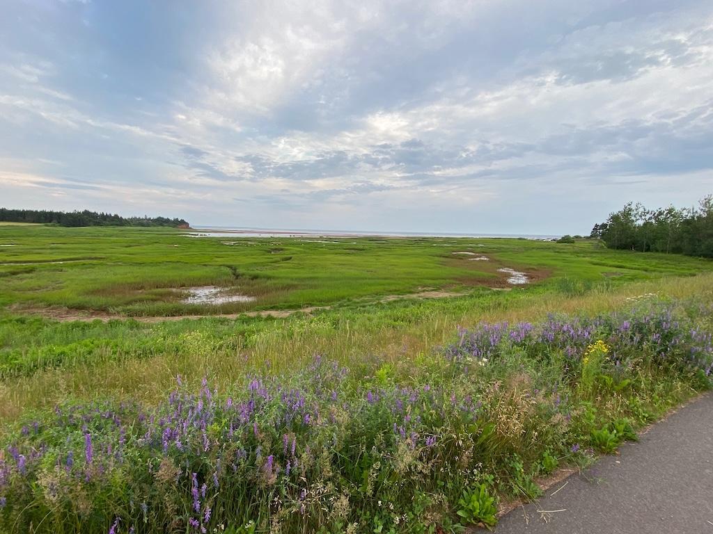
If you live in Charlottetown, like we do, and you want to swim in the ocean, the quickest solution is to make the quick drive (or bus) over to Kinlock—it’s only about 10 minutes—a drive that rewards you, no matter which way you approach it, with a stunning view of the Bellvue Cove and the Bellvue Point cliffs beyond.
Lisa held a rendering of Kinlock Beach implanted in her (very visual) head for several months, and July, the month where we spend more time swimming than any other (and when Kinlock Beach is at its most scenic), seemed like the right moment to bring it to life on a box.
We took a look at our collected images of the beach, made an impromptu early evening scouting trip, and came up with two images that we used as references.
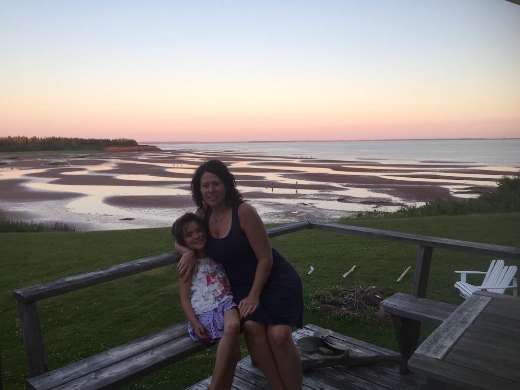
First was a photo from some years ago, taken of Lisa and L. on the deck of a cottage they were staying at. We loved this image for the gradient of the sky, from blue to yellow to pink:
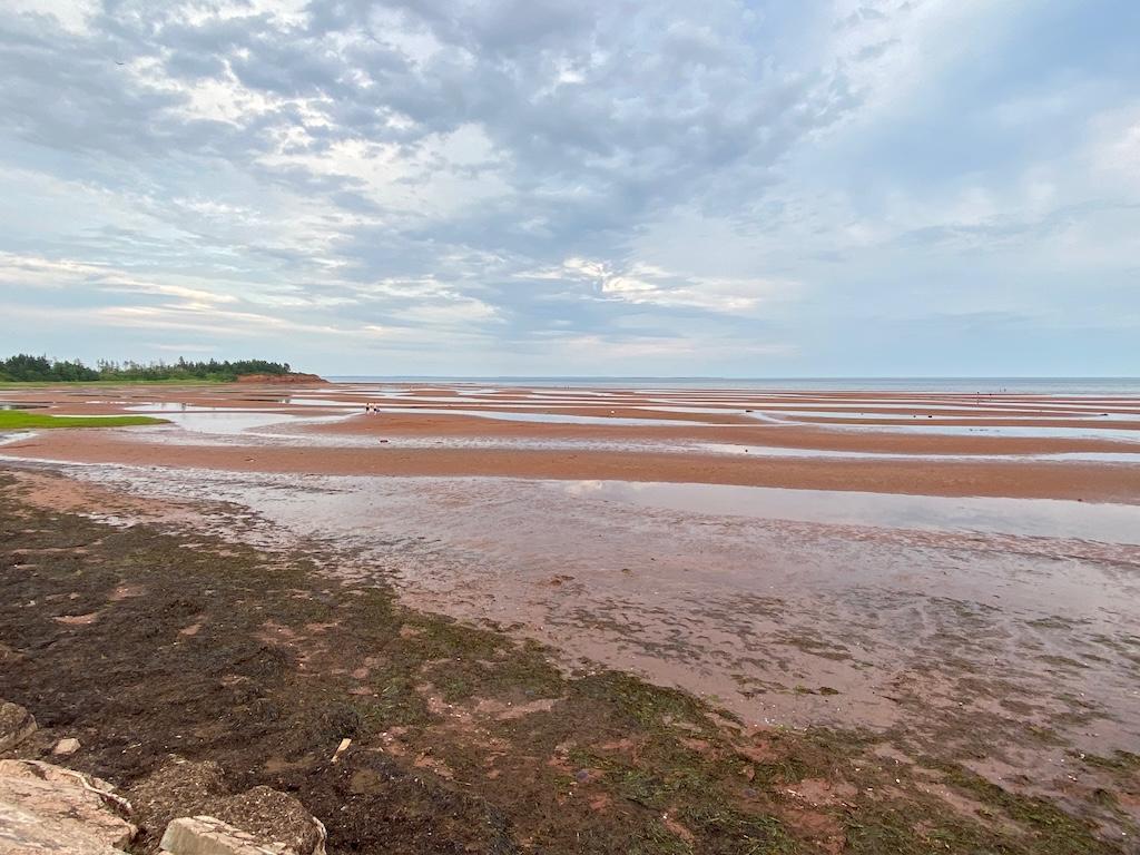
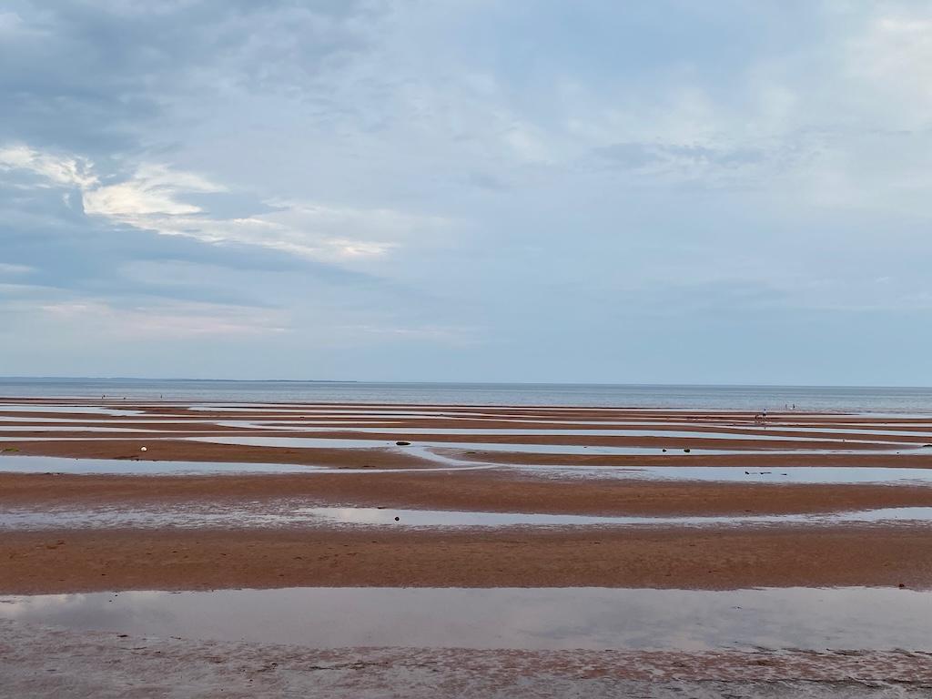
Second was this image we took on our scouting trip, which we liked for the relationship of the cliffs, tidal pools, and grasses:
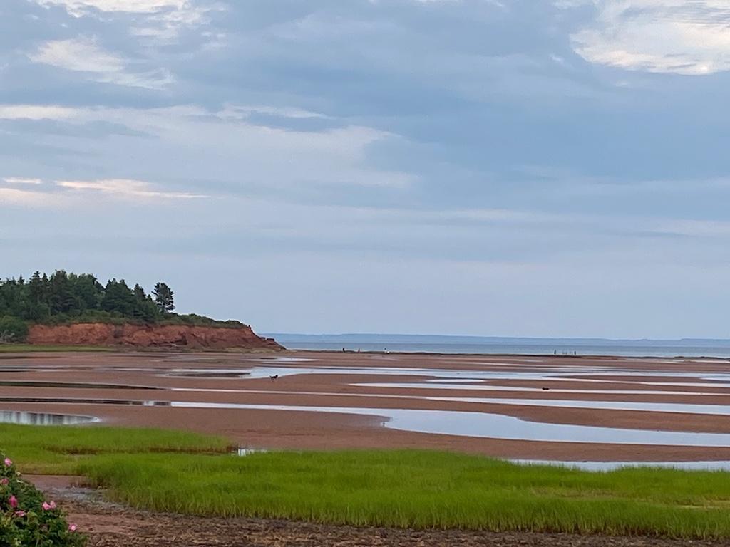
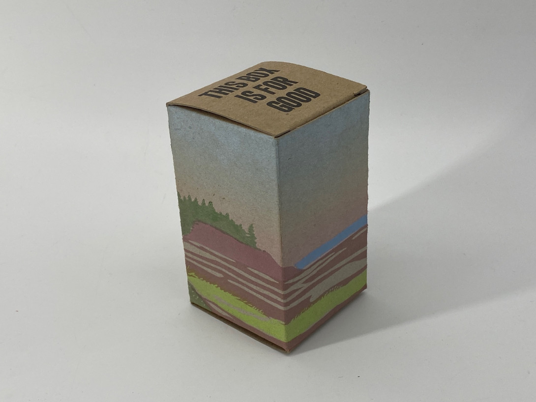
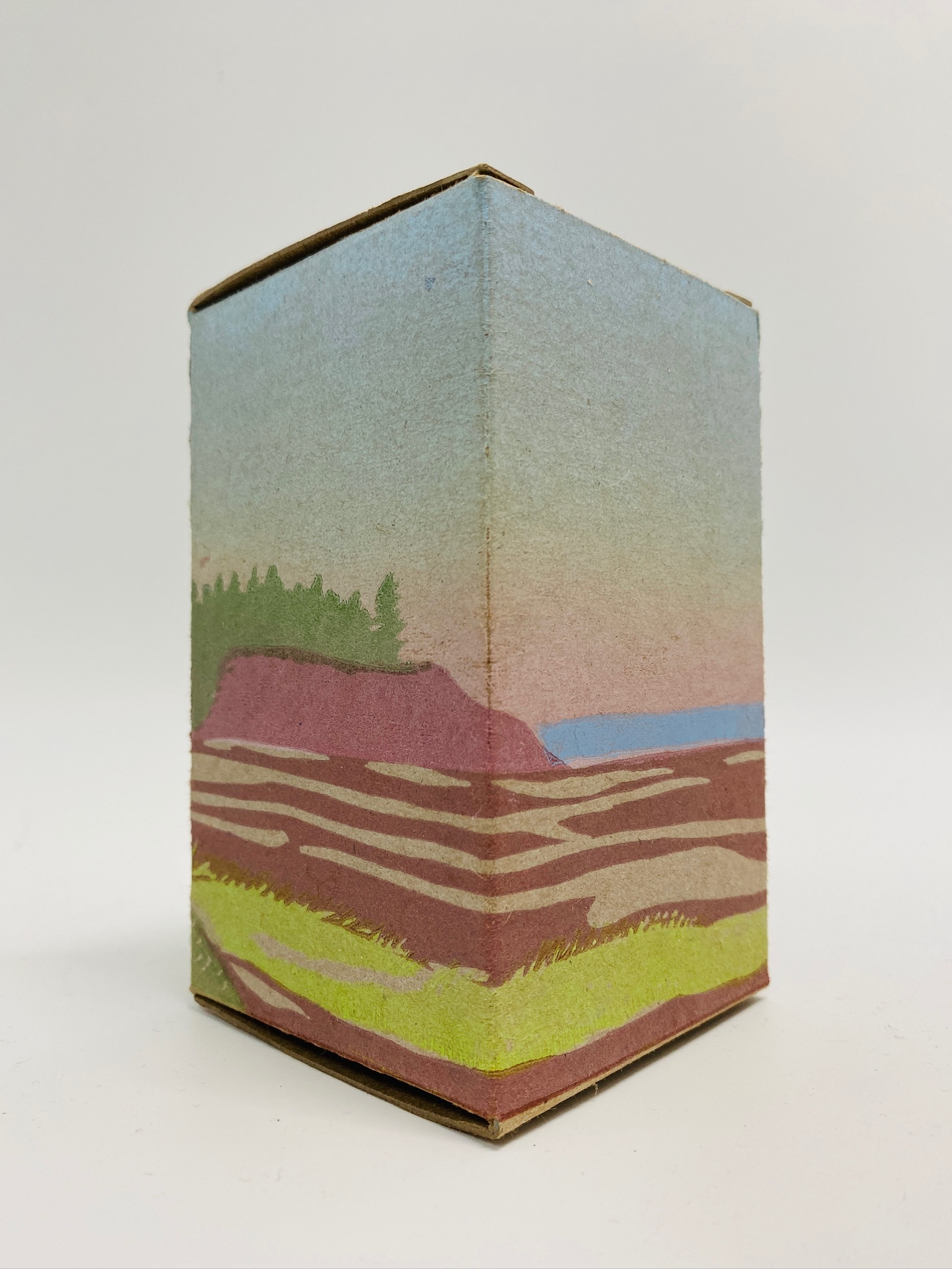
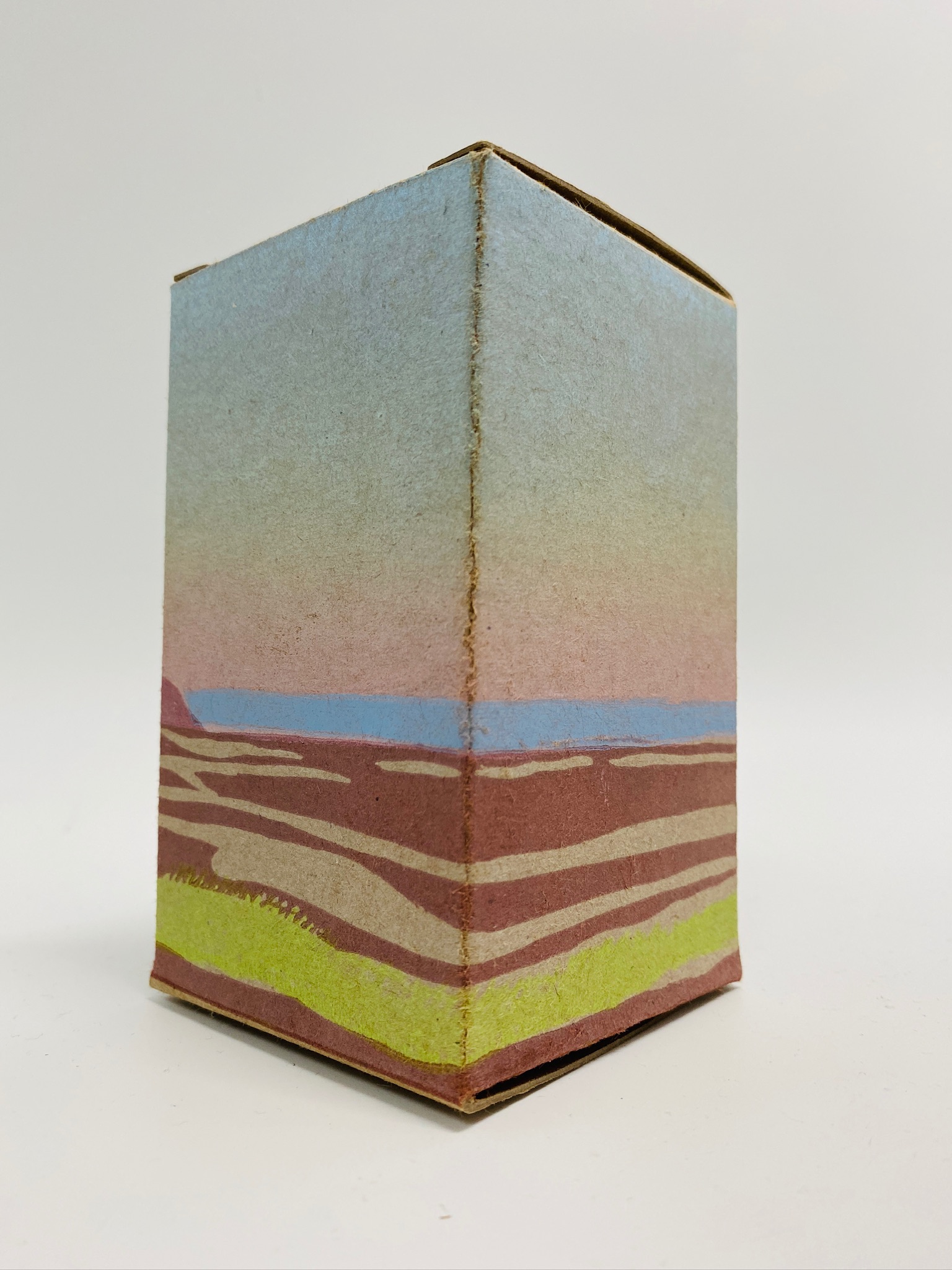
These images together capture everything that’s lovely about the beach: the vibrant sky, the bright green tidal marsh in the foreground, the beach at low tide, with its tidal pools, and the red cliffs in the background, topped with dark green trees.
The Sky
The first step of our plan was to render the sky using a “rainbow roll,” something best explained visually.
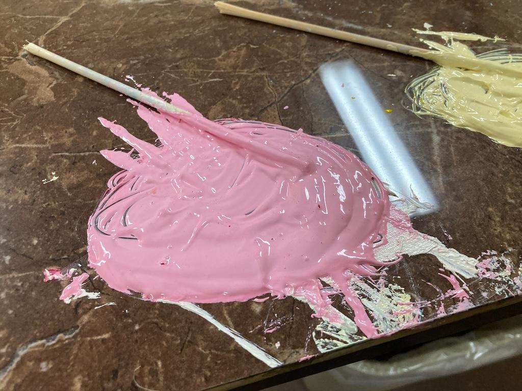
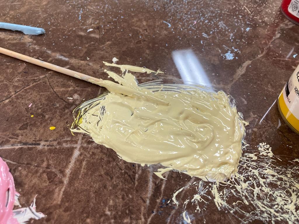
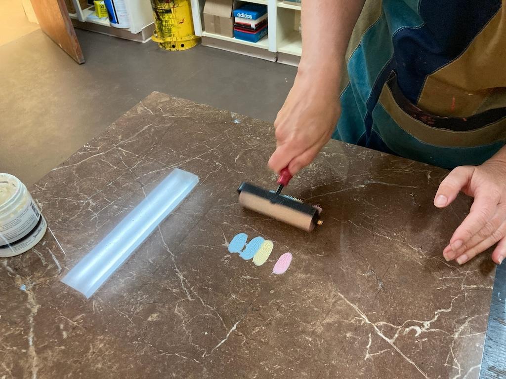
We started by mixing shades of blue, yellow, and pink ink:
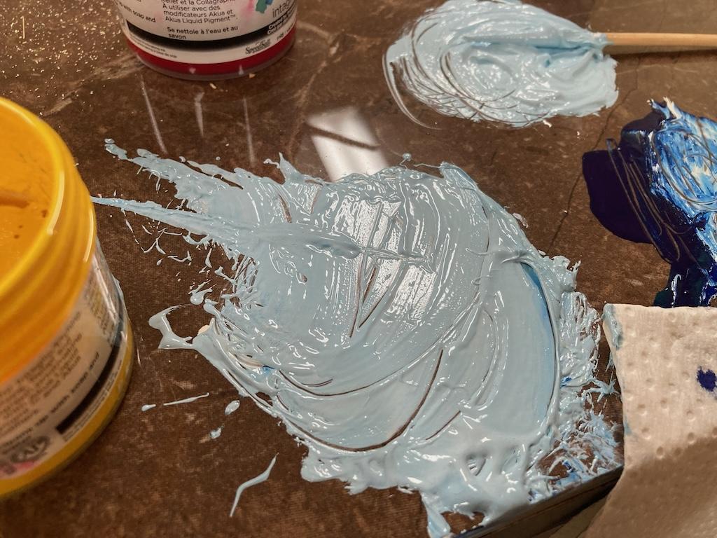
We dolloped small amounts of each colour beside each other, the total width being about what we needed to render the sky on the box:
With a brayer, these then got combined slowly so that they subtly overlapped:
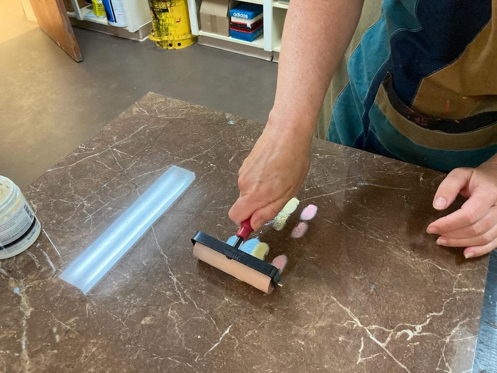
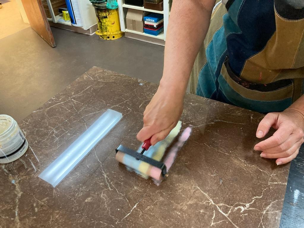
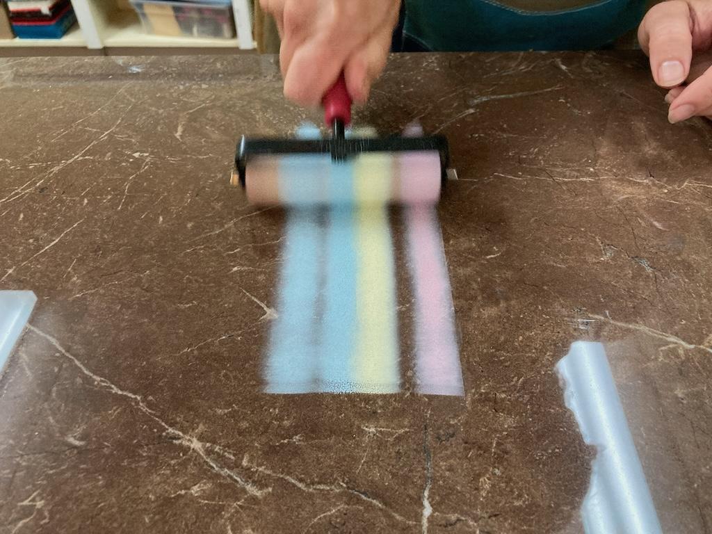
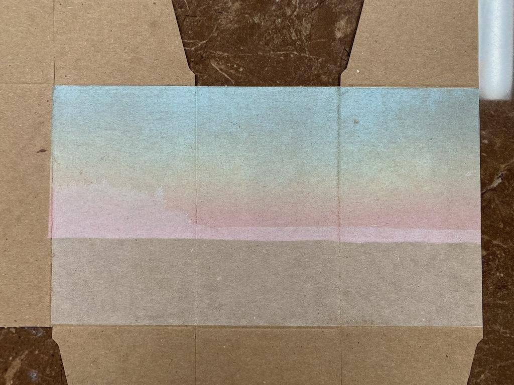
The result—and hence the name “rainbow roll”—is a continuous gradient of colour:
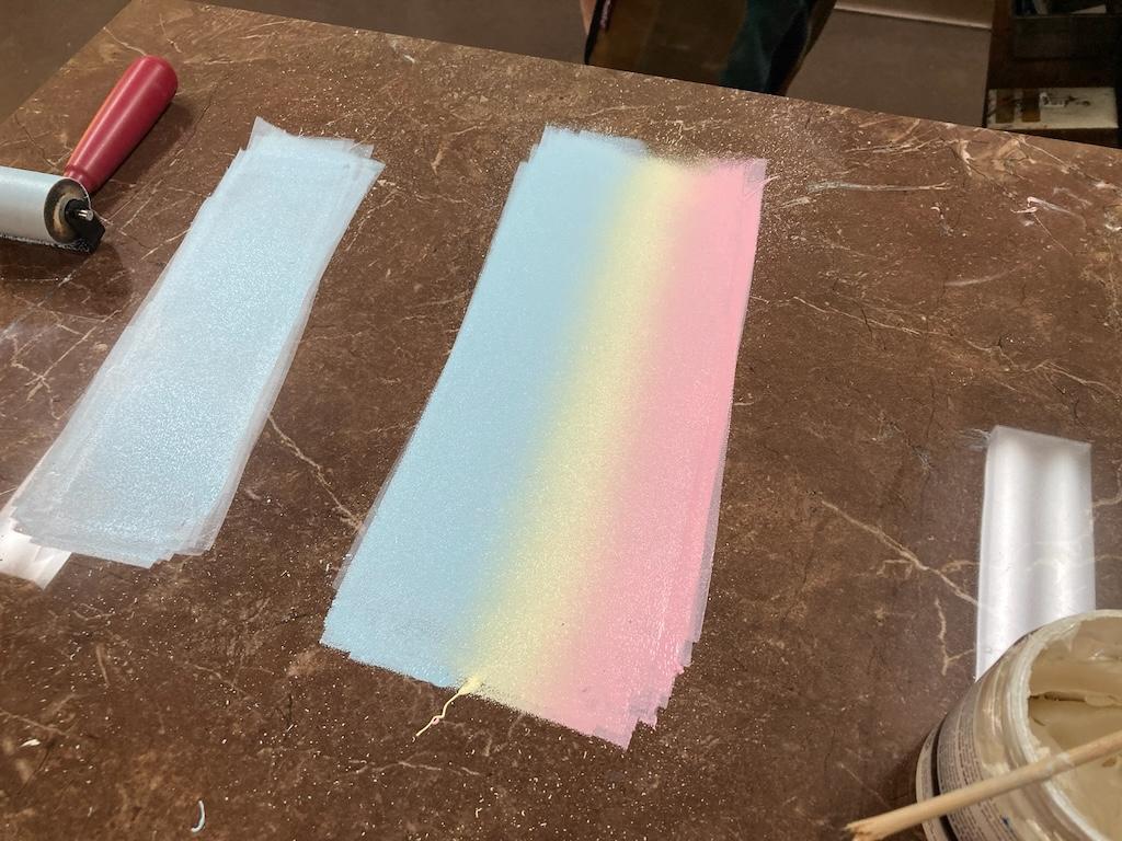
With the brayer, this rainbow of colour then gets hand-rolled onto the lino block, carved to the right size:
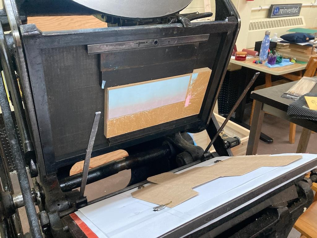
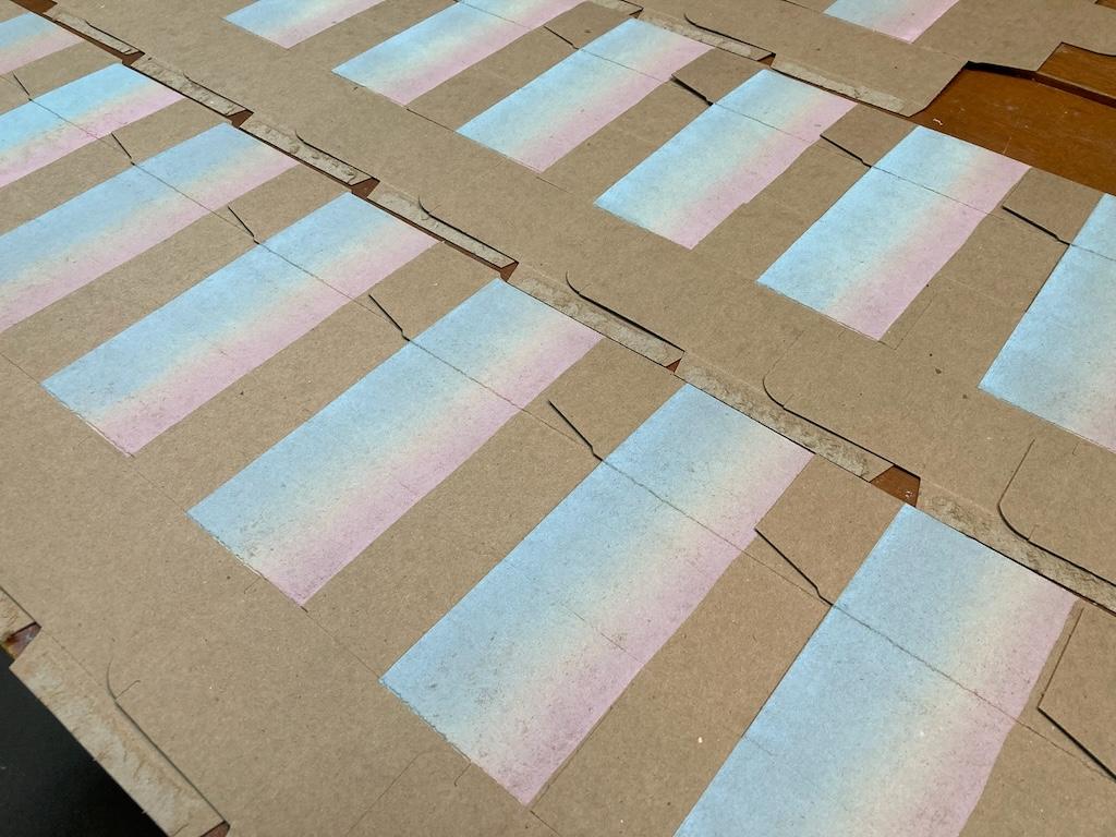
When printed on the box, the result is the “evening sky,” with a gradient from blue sky to pink at water’s edge:
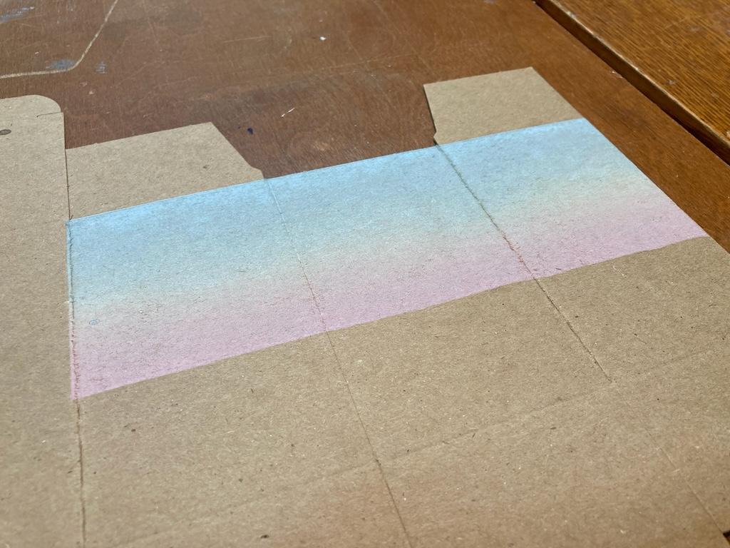
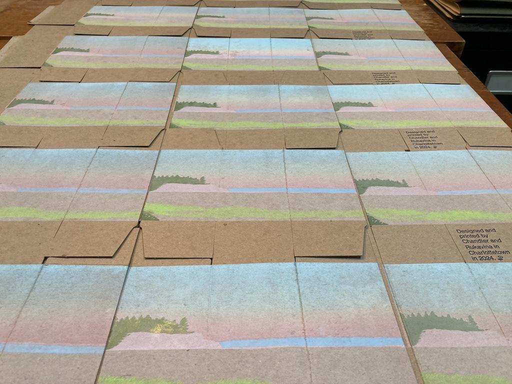
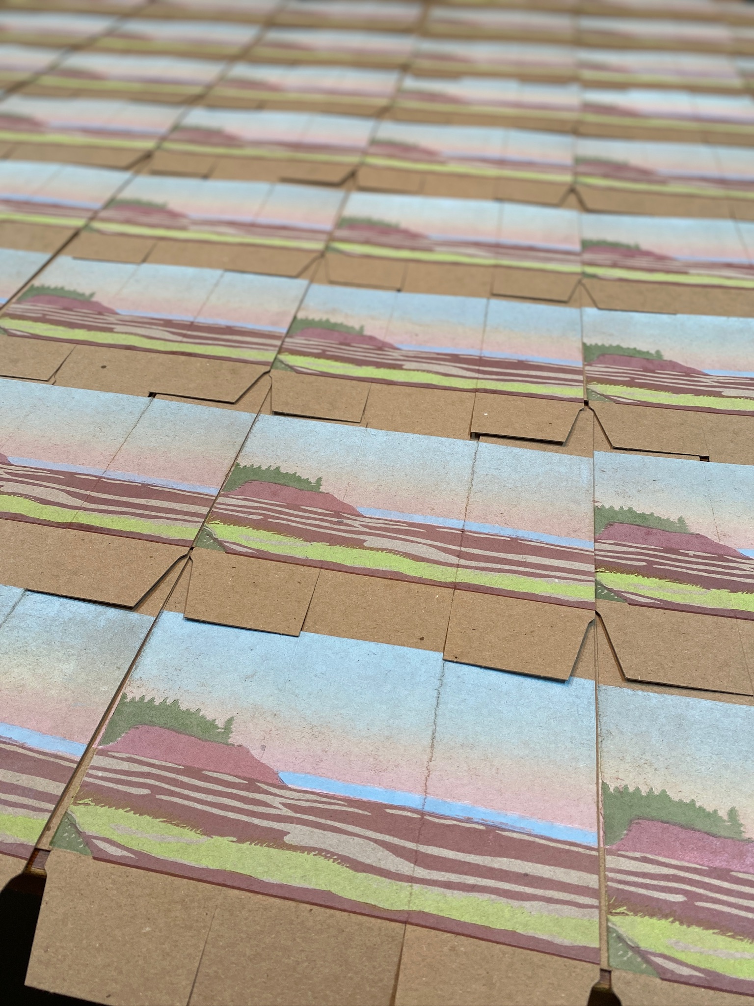
We printed all of the boxes with this rainbow rolled sky, and set them to dry:
The Land and Sea
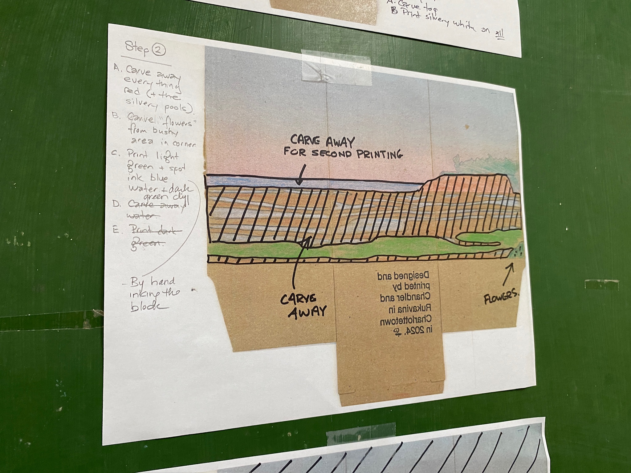
With the “sky” printed, we came up with a plan for other layers to print on the box, starting with a rough sketch that Lisa made from the reference photos (reversed, to reflect how we needed to carve the lino block): what to carve, what to leave in place, for each colour.
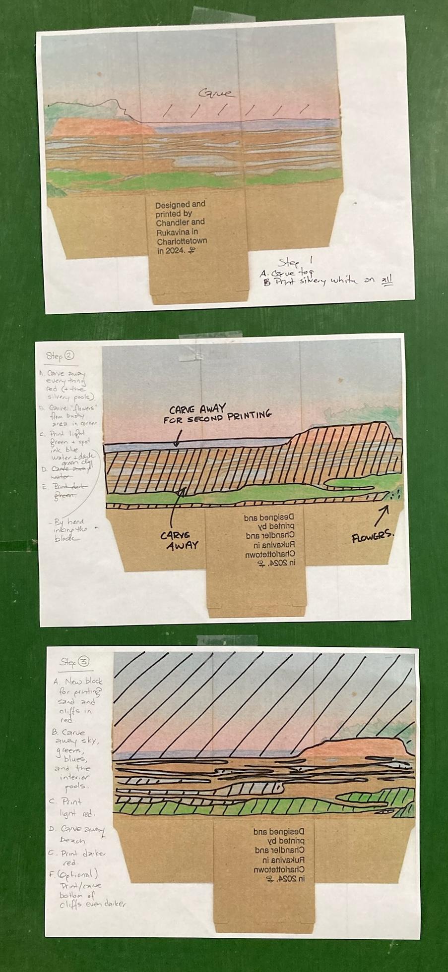
The idea was to print this, using two separate lino blocks, as a “reduction” linocut, printing light colours first, carving away what’s to remain in darker colours, and so on, gradually removing parts of the block until the darkest colour is reached.
Here’s how we executed the plan:
Silvery White Background
Using the first block, print a solid layer of “silvery white” across the entire “land and sea” area of the box.
Here’s what the lino block looked like:
Here’s the the box before we printed:
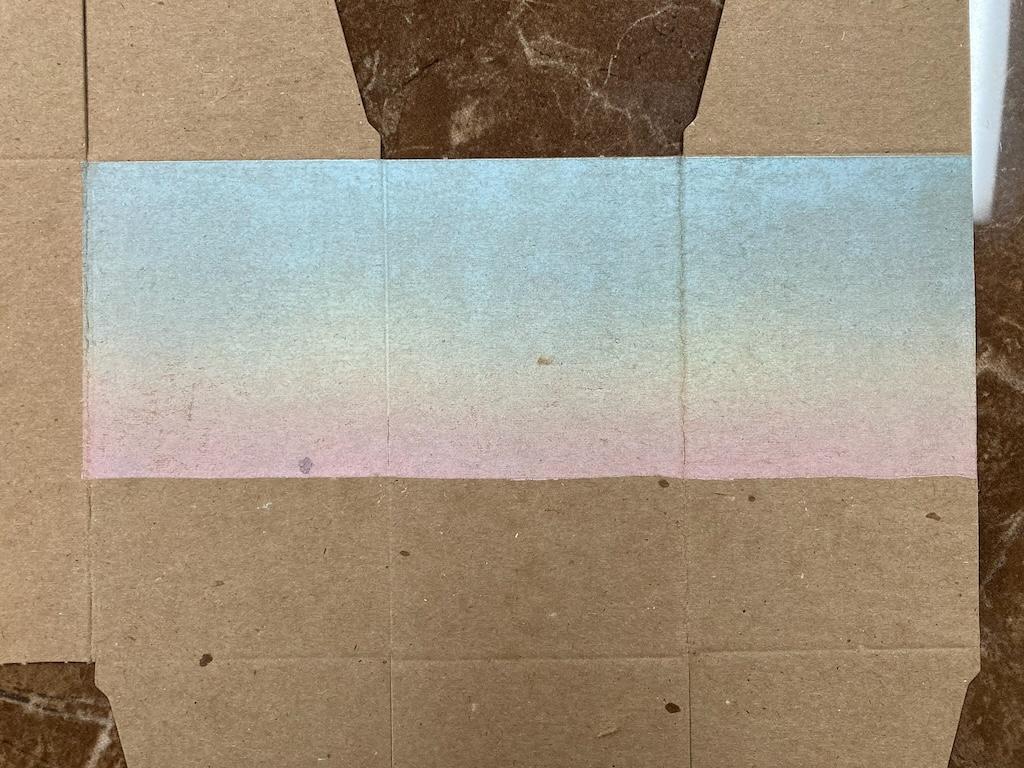
And here’s the box after we printed:
The effect is subtle, but this proved an important layer, as it will later define the colour of the tidal pools, and it affected the intensity of the colours we later printed over it.
Blues and Greens
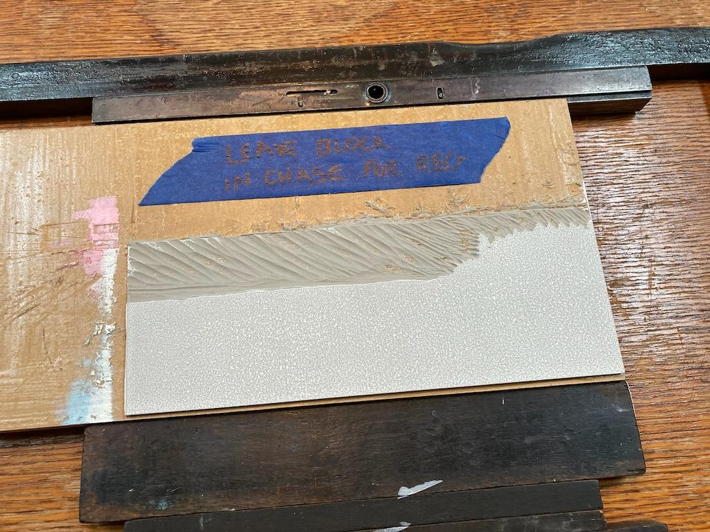
Next, on this first block we carved away all of the areas that would eventually be “red”, leaving the areas to be printed in blue and green.
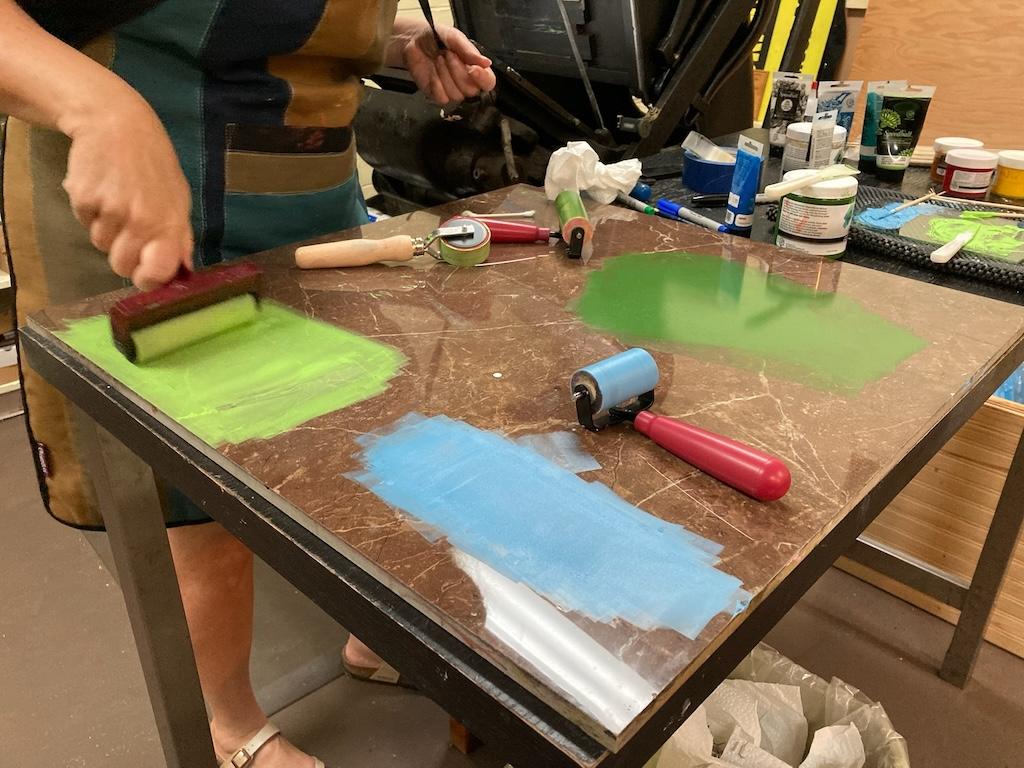
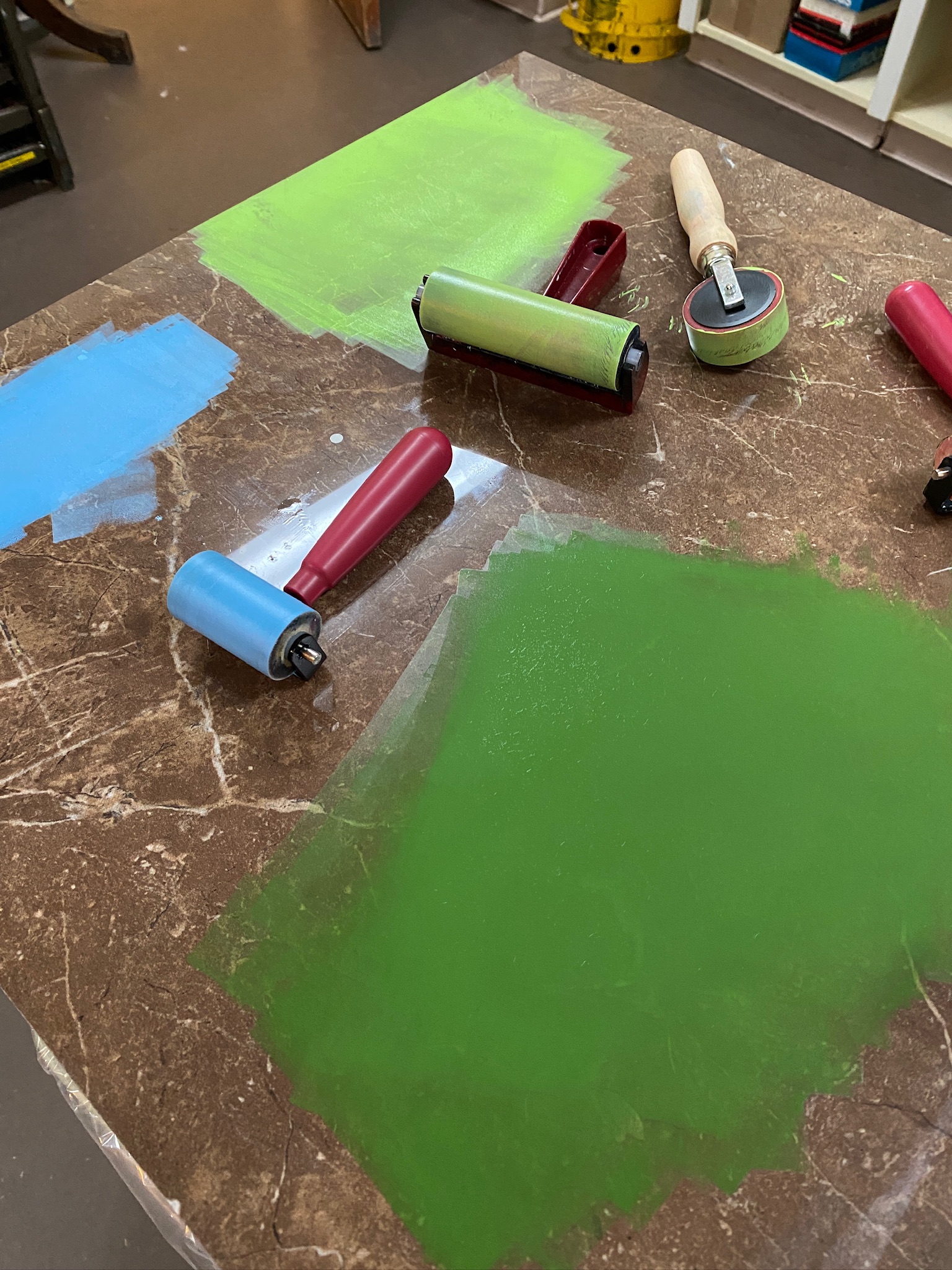
We decided to “spot ink” one shade of blue (for water) and two shades of green (dark for cliffs, lighter for grasses) all at the same time. Spot inking simply means we take the brayer and carefully apply ink to just certain areas of the block.
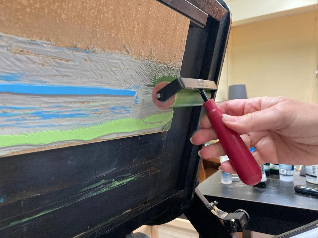
As a result, our ink table had quite an inking operation going on, with greens and blues and their respective brayers:
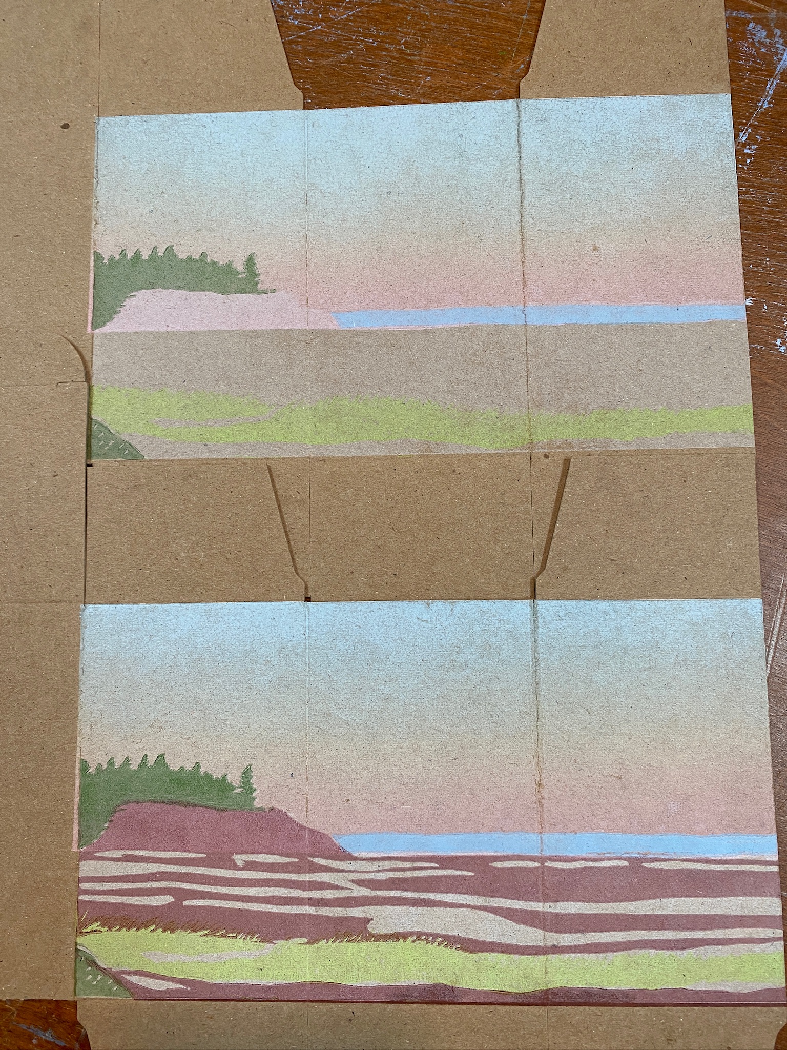
Once printed, the scene started to “look like the beach,” albeit with some important areas still to be filled in:
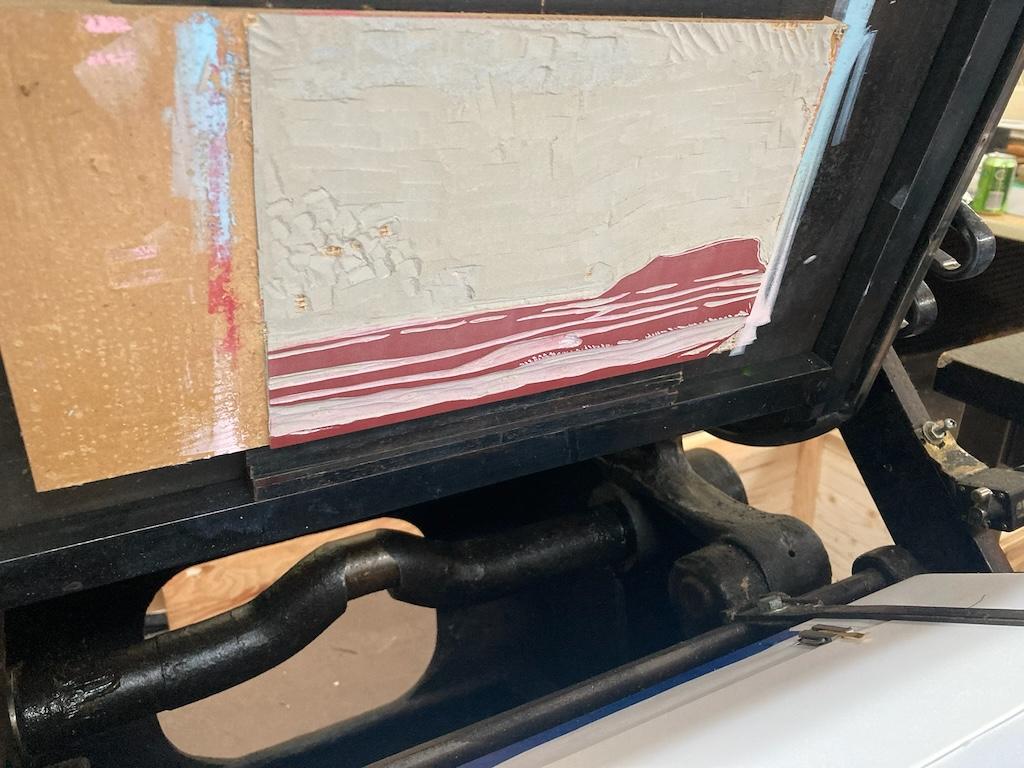
Red
Because we’d already carved away everything to be printed in red, we switched to a second lino block, and carved away everything except what was to be printed in red—the sky, the areas already printed in blue and green. This meant for a lot of carving:
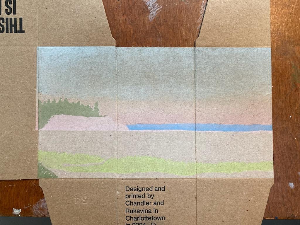
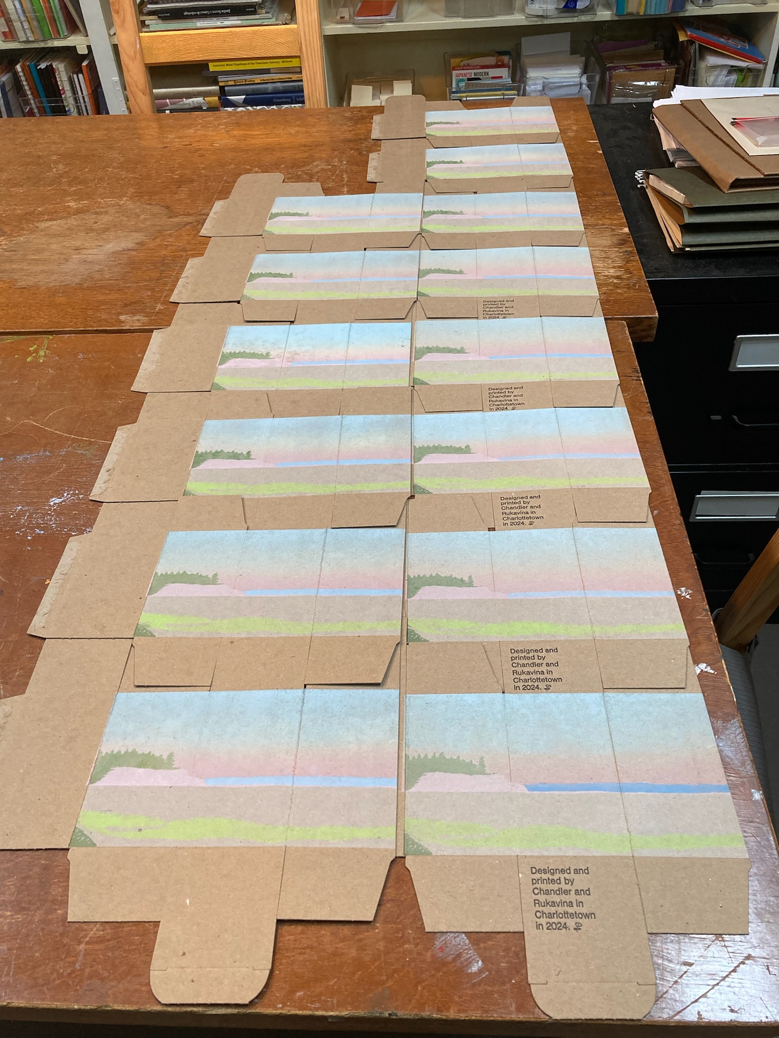
Once we printed the red layer, everything magically “popped” into looking like Kinlock Beach:
The change with the red layer added is even more evident when you compare the “before” to the “after”:
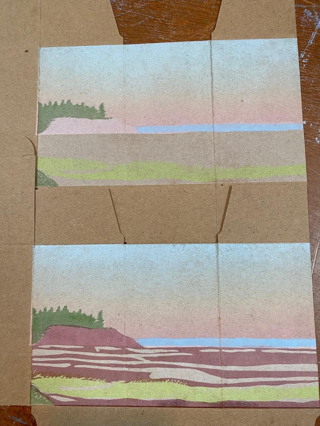
We’d thought we might have to print two layers of red, a dark one and a light one, but it turns out that the effect of the cliffs having the original rainbow rolled sky as an underprinted layer meant that the cliffs and the sand were sufficiently distinct from each other that we didn’t need to do that.
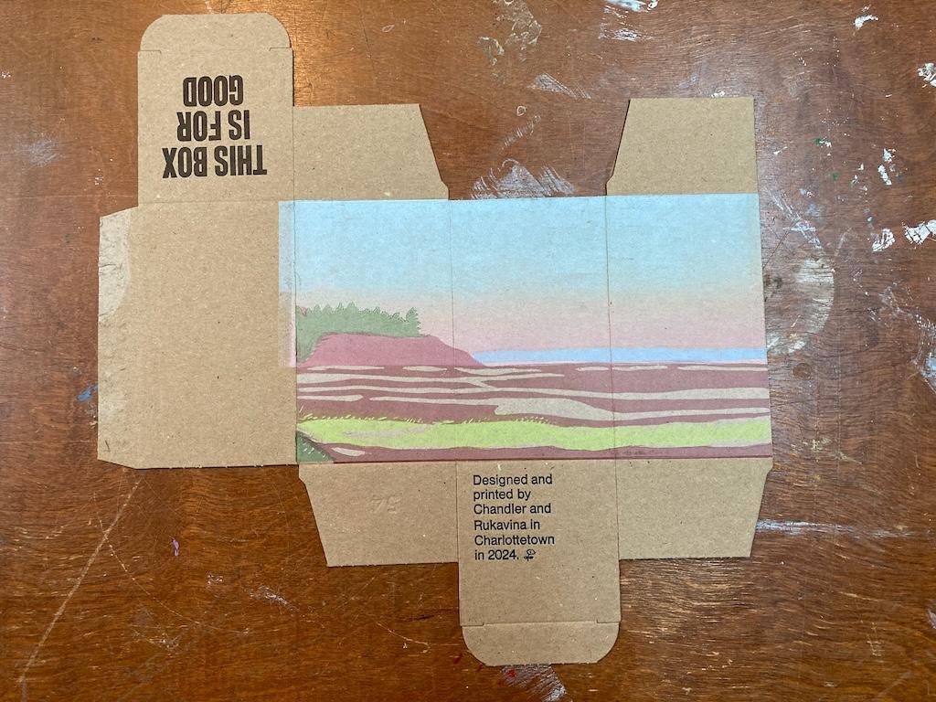
The Text
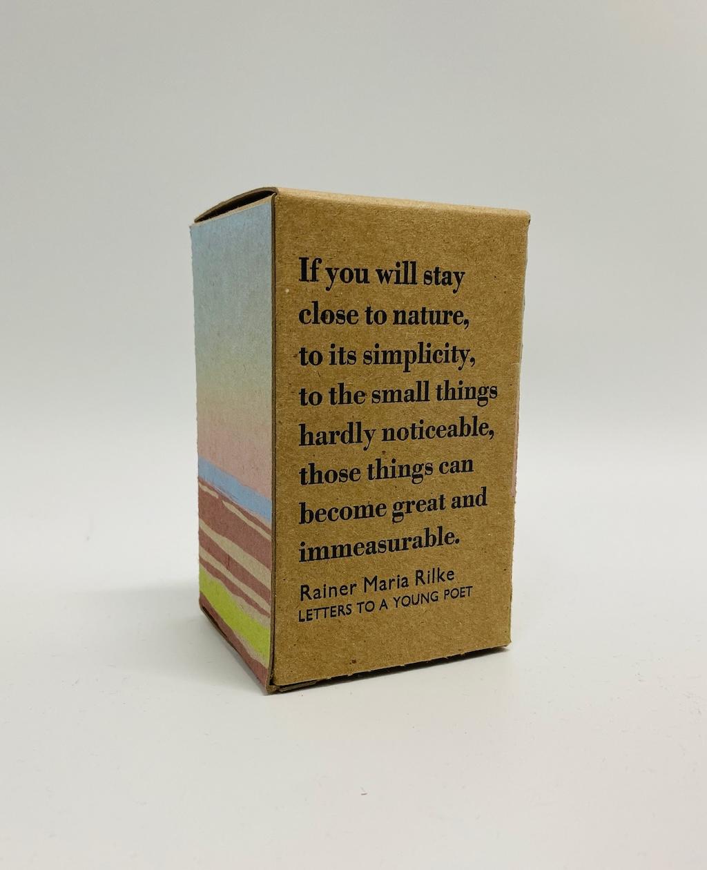
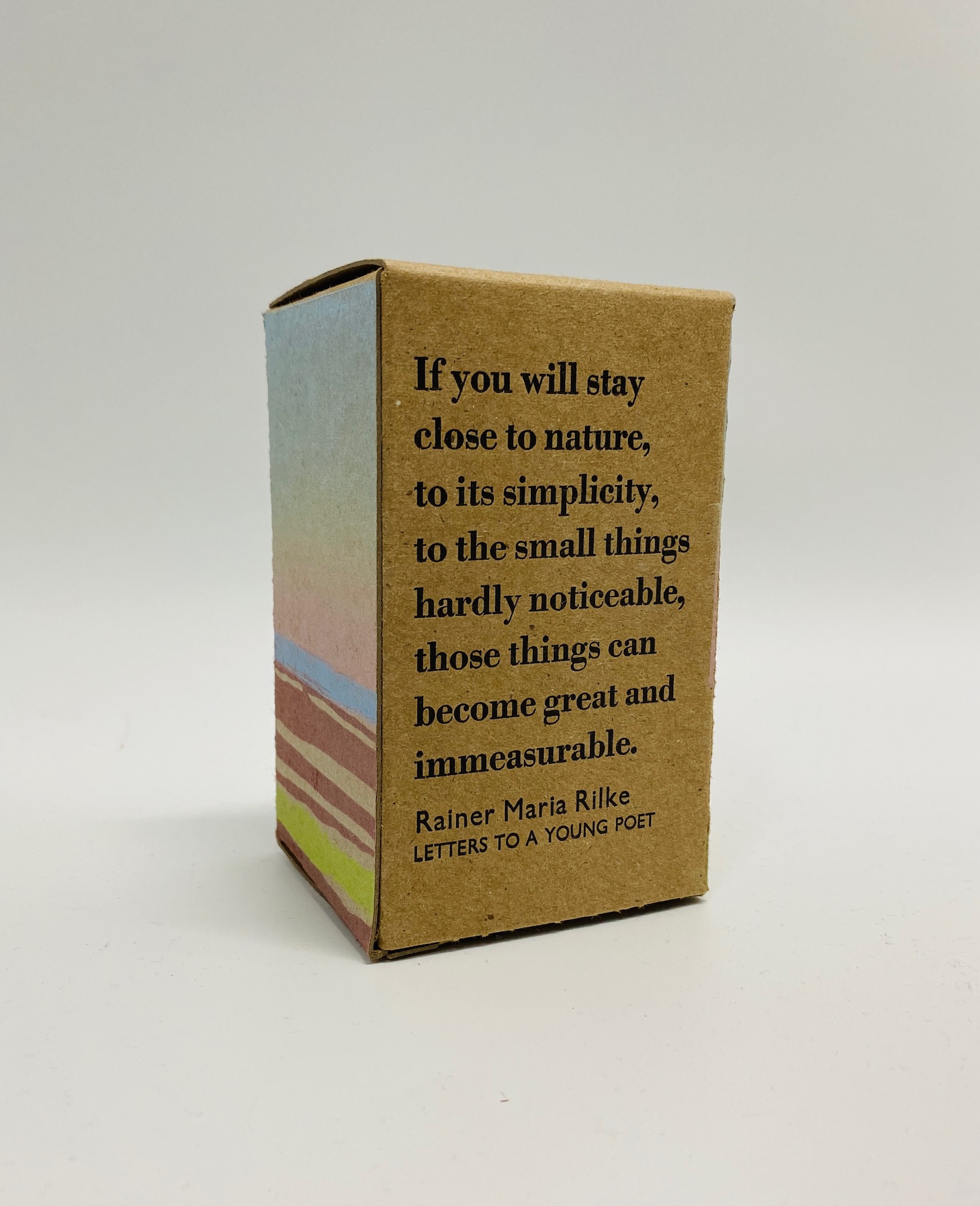
If you’ve been paying careful attention, you may have noticed that we only printed three of the four panels of the box, a departure for us. This is because we decided to save the fourth panel—the back of the box, when it’s folder together—for a piece of text. We selected this quote from Rainer Maria Rilke in Letters to a Young Poet:
If you will stay close to nature, to its simplicity, to the small things hardly noticeable, those things can become great and immeasurable.
We set the passage in 24 point Bodoni bold, and the credit in 12 and 18 point Gill Sans, and printed it in black on the remaining empty panel:
The Bookmarks
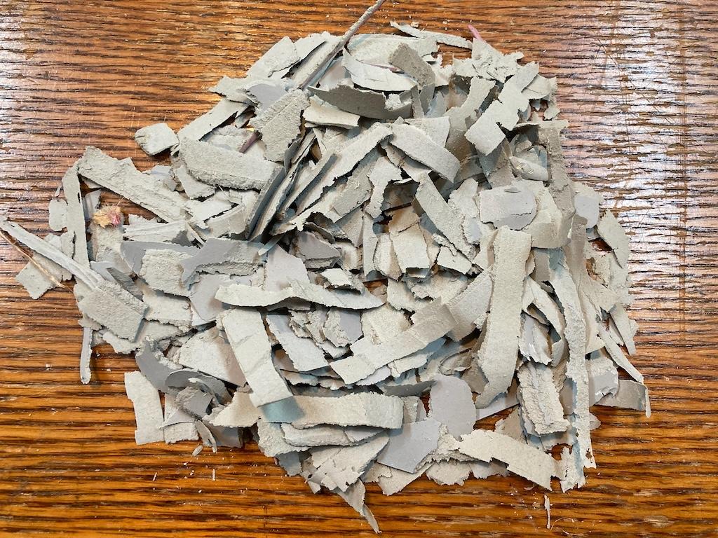
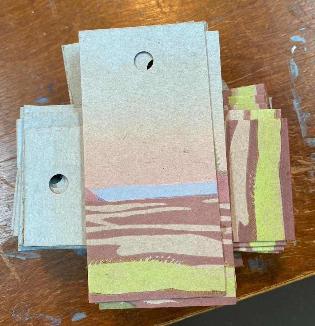
As we did for our June box, we used the misprints — we had more than our fair share for this box, given its complexity and layers — and cut them up to make bookmarks:
Sending Them Out
In early days of our project, we strained to find recipients for all the boxes — we’ve ended up printing 30 to 40 for each month, and that’s a lot of people, once we’d sent one to all our friends, all our family members.
This July box, however, proved less difficult: we knew people with a connection to Kinlock would would be logical recipients; we gave some to our north shore neighbours and friends, to cousins we’d neglected in earlier rounds, and to people who’d requested boxes.
In the end, we managed to give them all away in just a few weeks.
Where This Box Has Been
18 boxes with 30 registrations across 21 unique locations:
| Box Number | Registrations | Journey |
|---|---|---|
| 838 | 6 | Stratford, Canada → Kittery Point, United States → Minneapolis, United States → Robbinsdale, United States → Apple Valley , United States → Richfield , United States |
| 805 | 4 | Burlington, United States → Burlington, United States → Underhill, United States → Clearwater , United States |
| 834 | 3 | Charlottetown, Canada → Summerside, Canada → Kingston, Canada |
| 802 | 2 | Belchertown, United States → Jacksonville, United States |
| 819 | 2 | Amherst, United States → San Diego, United States |
| 800 | 1 | Shefford, Canada |
| 803 | 1 | Charlottetown, Canada |
| 806 | 1 | Philadelphia, United States |
| 817 | 1 | Milton, United States |
| 820 | 1 | Charlottetown, Canada |
| 825 | 1 | Stratford, Canada |
| 827 | 1 | Charlottetown, Canada |
| 830 | 1 | Charlottetown, Canada |
| 833 | 1 | Stratford, Canada |
| 835 | 1 | La Malbaie , Canada |
| 836 | 1 | Stratford, Canada |
| 839 | 1 | Morell, Canada |
| 840 | 1 | Charlottetown, Canada |