Edition Details
Just before Christmas, my Dutch friend Ton pointed me to the printer Roy Scholten, based at Grafisch Atelier Hilversum in the Netherlands, and suggested we might connect.
At the time Ton didn’t know of our plan to take This Box is for Good on the road to Europe. He can be forgiven, as we didn’t know of our travel plan at that time either, and even the project itself was but a nascent dream.
When, in March, we decided to look for European printers to partner with, Roy was my first thought; I sent him an email and he quickly replied “The short version: yes, absolutely, come on over, we’d be happy to host you.”
And that is how we came to be spending two days last week collaborating with Roy in Hilversum.
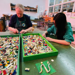
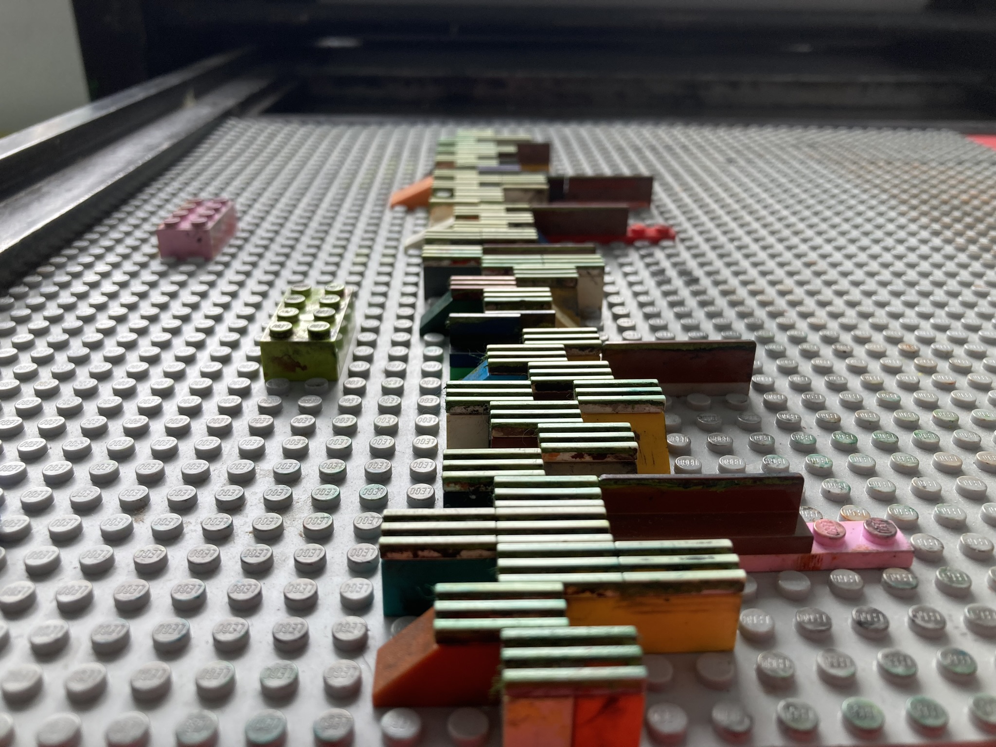
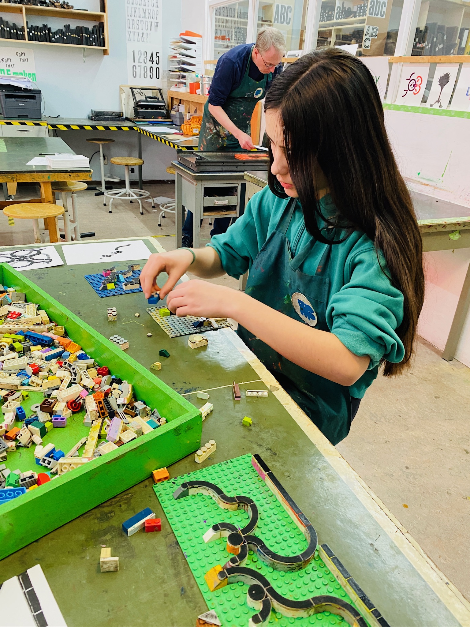
Roy, with Martijn van der Blom, instigated the “Hilversum Method” of using Lego on the letterpress. Born of a desire to find a way for children to learn letterpress printing, but without exposure to metal type, and freed from being bound to letterforms, the method involves using smooth Lego pieces, mounted on Lego plates, and brought to the standard “type high.” Like using metal and wooden type, the form it has limitations, but an entirely different set of them.
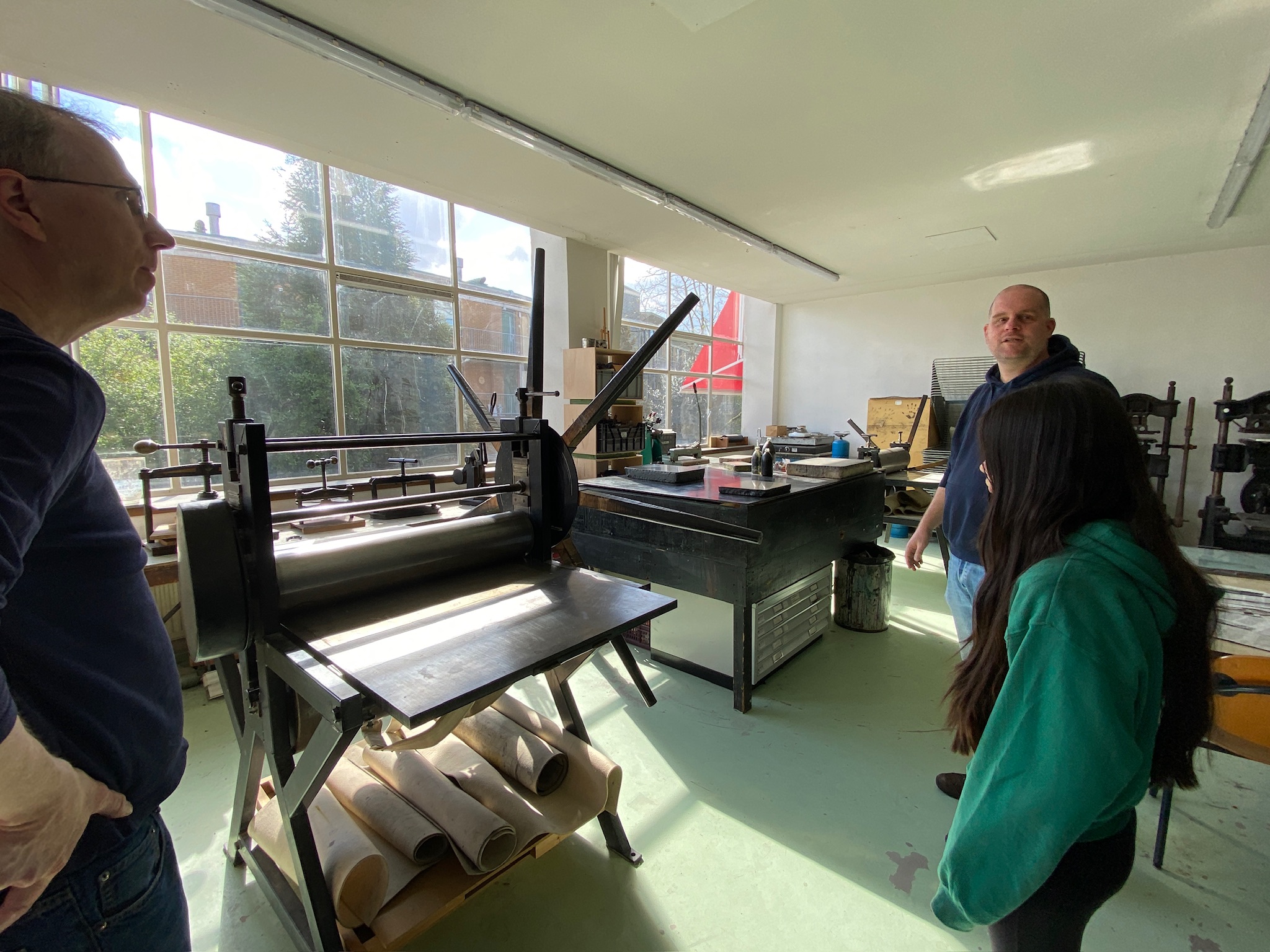
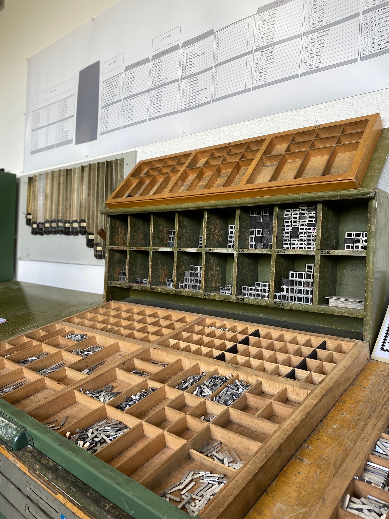
Grafisch Atelier Hilversum is a half-century old non-profit community graphics workshop filled with people and equipment in service of practicing myriad arts, including screen printing, etching, lithography, book binding, and letterpress. For someone like me, it is a veritable wonderland that immediately triggers strong “I must now move to Hilversum” thoughts.

Lisa and I sketched out the basics of the project in a Zoom call with Roy in March: we would arrive with 60 boxes, pre-printed with “This Box is for Good” on the top flap, and a credit line on the bottom flap, but otherwise ready for… something.
And that was, indeed, how we arrived at the shop on Thursday morning: the boxes in our backpack, hauled from Canada, an empty canvas waiting for an idea.
Roy, who is a skilled, engaging, creative teacher and collaborator, started us out with a briefing and a tour, and then we dove into an exploration of Lego and printing.
Roy is very much in the “don’t describe it, make it” school of pedagogy, and so it wasn’t long before we had inky fingers, facility with using the proof presses, and a gaggle of possible concepts from which a box design might spring.
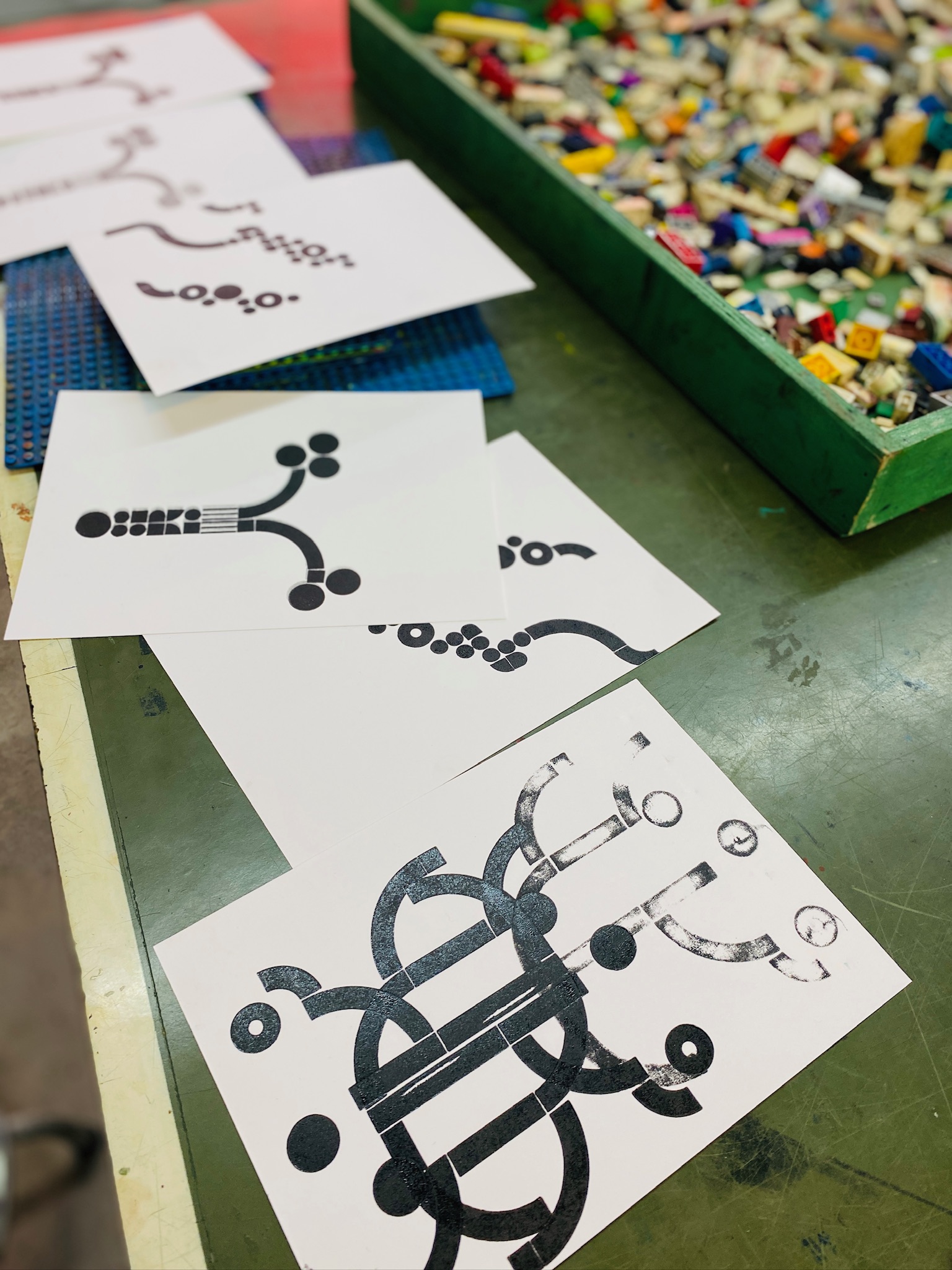
What emerged was the result of a collaboration, with a concept of young L’s anchoring it: a set of vertical lines approximating shoots, with abstract “lupins” springing from them, overlaid on an abstract line of circles and squares as a framing device. Here’s an early test print that incorporates all of the elements.
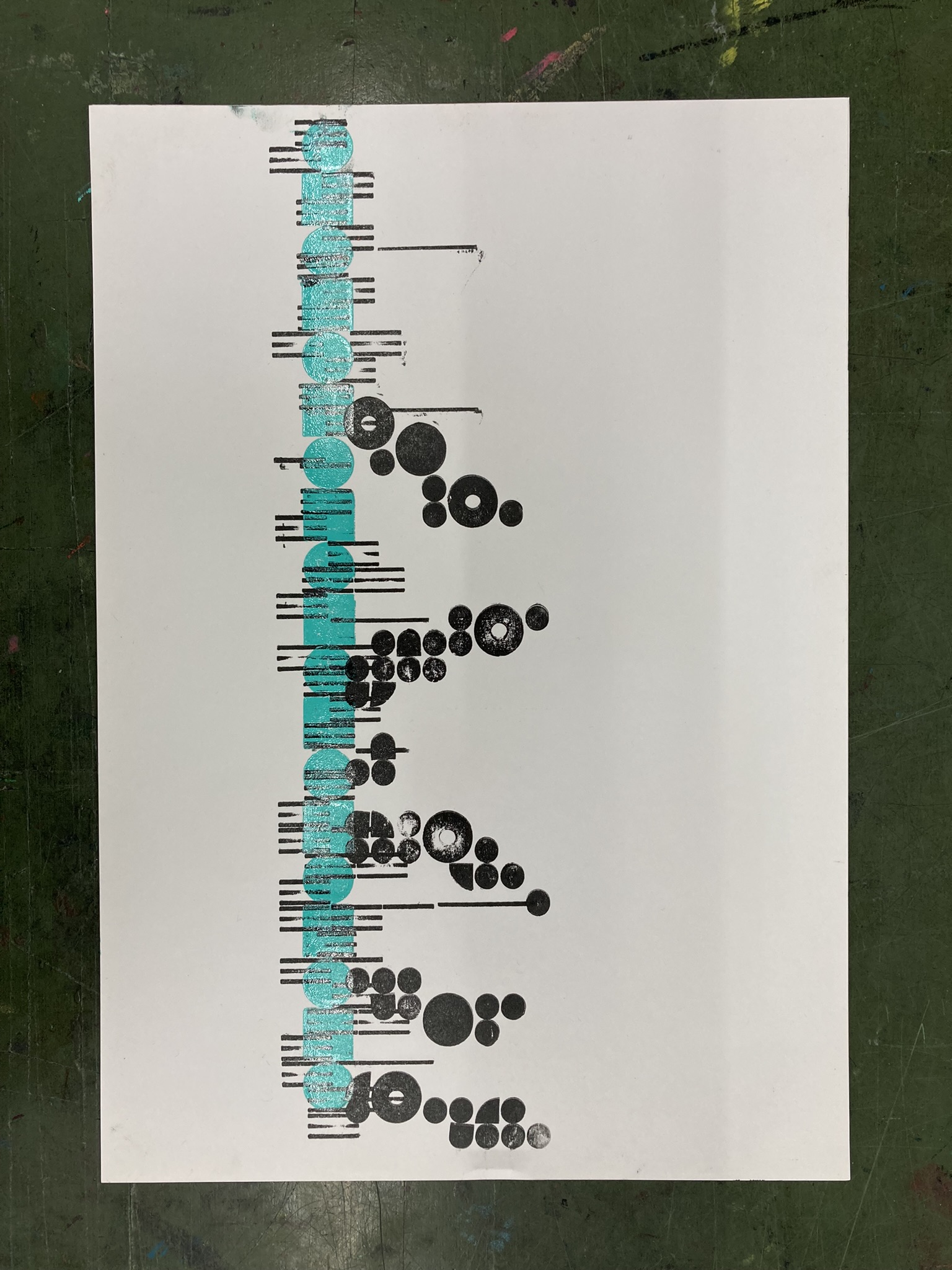
We were off and running!
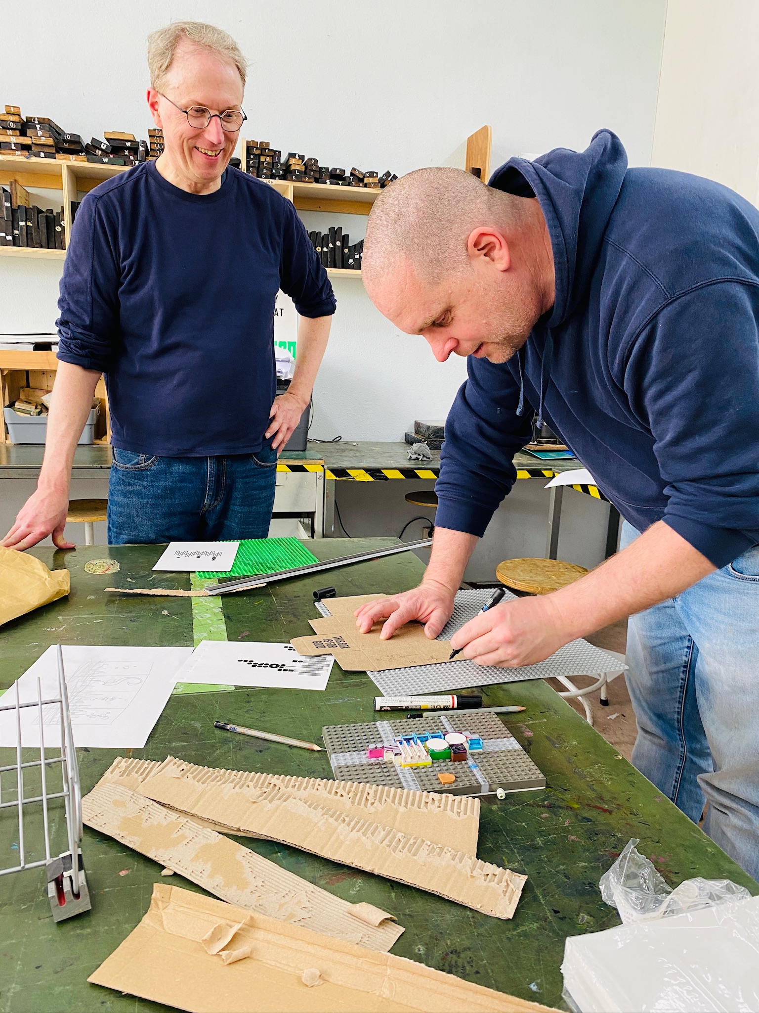
Collaboration, it turns out, especially among four people with strong aesthetics, can be hard. At each fork in the road—positioning, colour, complexity—we needed to negotiate the best way forward, navigating through the mine fields of strongly-held opinions. We always found our way through, sometimes with discomfort, sometimes with compromise. It was a learning process for all of us, I think.
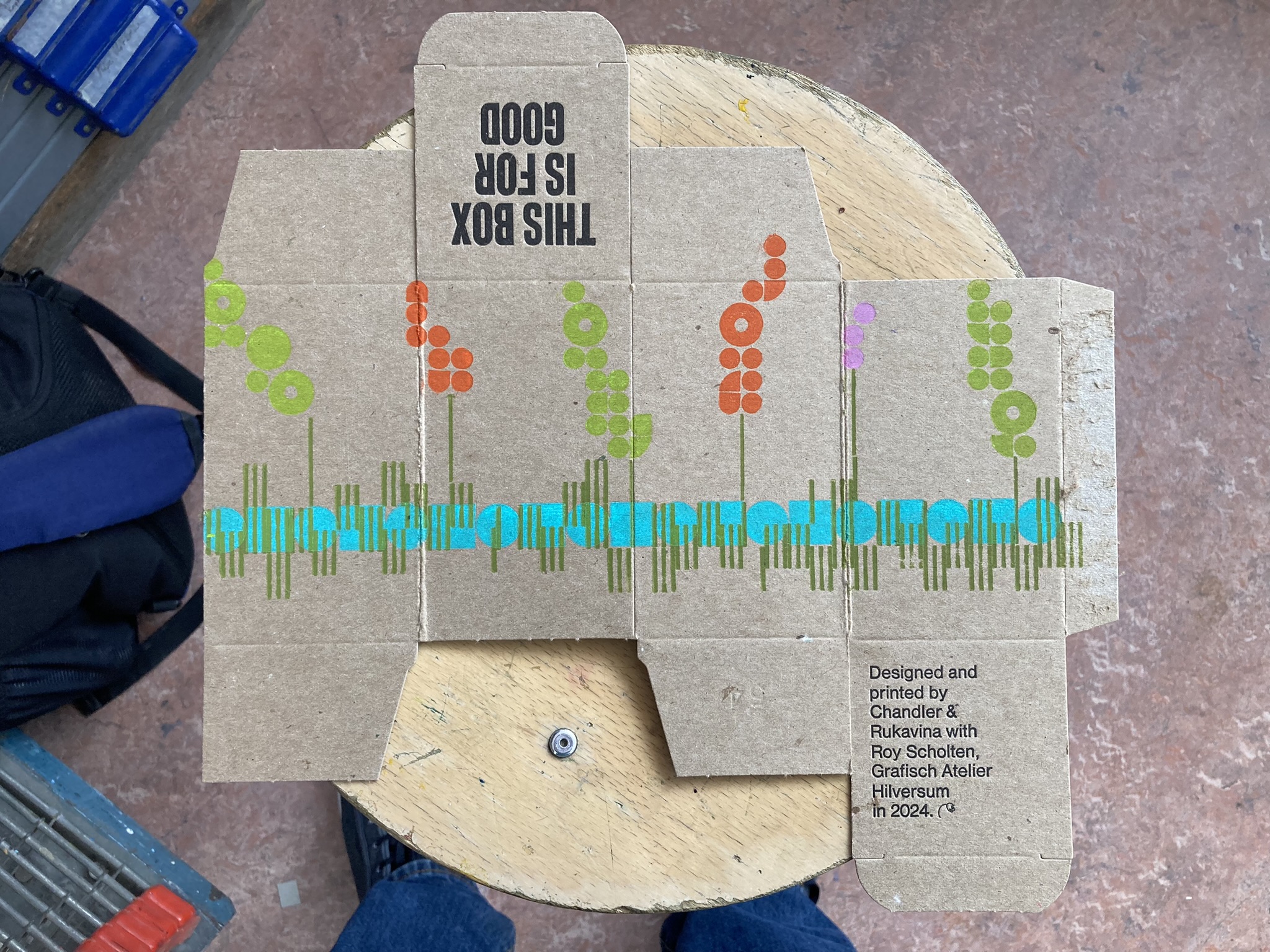
For example, Lisa has a strong colour-sense, whereas I’ve a fondness for, well, black. She found her way to describing the colour vision in her head (Roy and I preferred black for the “grass and shoots,” while Lisa advocated for a blue-green tone-on-tone; we tried both and each ended up preferring the other).
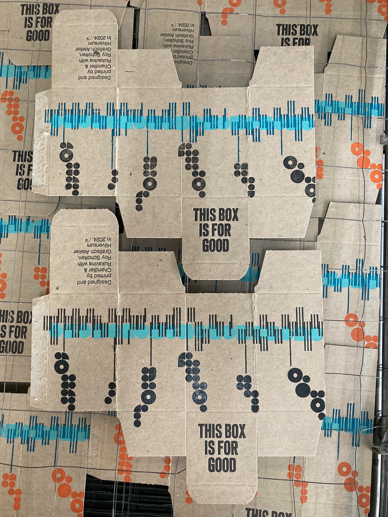
The “edition” of 40-odd boxes ended up incorporating several variations of colour and design. Here’s one of my favourites, one that incorporates some colourful “outliers”:
Here are some other designs, on the rack to dry, that show some other colour combinations:
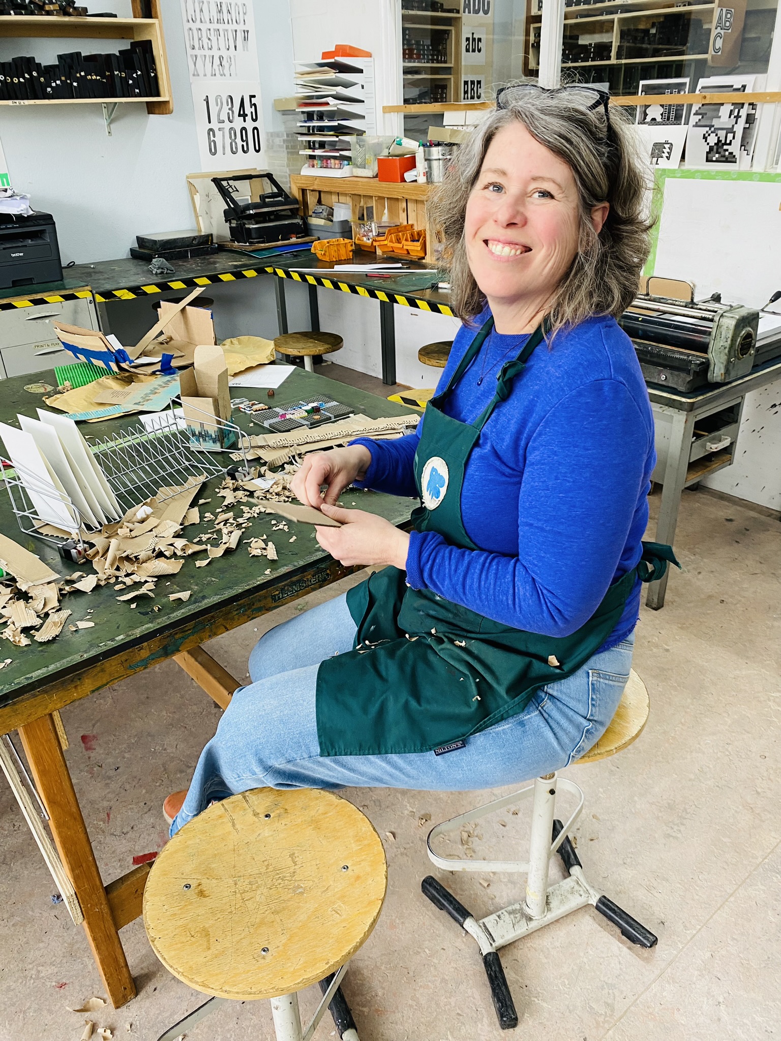
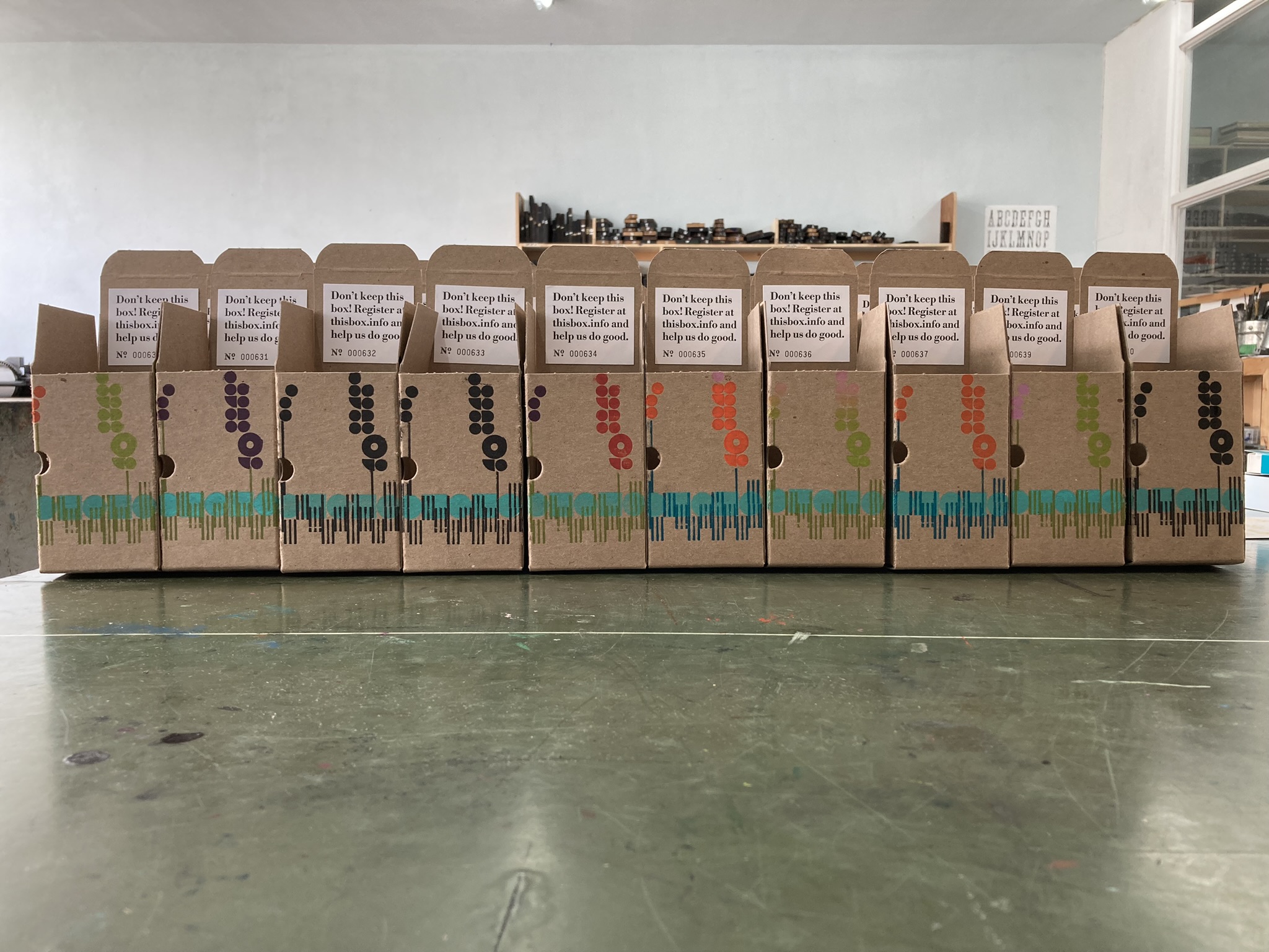
It took us two full days in the shop for design and print, plus a third morning for punching holes (a brilliant idea from Roy), gluing, and assembling the boxes.
As to what was to go inside the boxes—always, it seems, a last minute rush to the finish—we were both prepared and not. In Sweden, the previous week, our friends Luisa, Olle, Nene, and Loe gathered in Luisa’s shop to help us make notebooks to include in the boxes. We made the notebooks with heavy paper covered in brown card stock, sewn with a simple pamphlet stitch with golden thread. We also made gilded cards, with a “mod” pattern, to glue to the notebooks.
Otherwise, we reasoned the including Lego of some sort would be a good idea, so we went to the Lego store in Utrecht over the weekend with Ton, Elmine, and their daughter and found some pieces that, somehow, were just right. And we added some Lindt chocolates from the store across the hallway.
We left the print shop Monday morning with plans for European distribution (thank you Roy, Martijn, Ton, and Frank), and with a bunch of parcels wrapped and ready to send to those who’d already contributed to the box.
When we got on the train to Milan later that night, we were happy but exhausted.
When we thought about the idea of taking L. out of school for a whole month for a European tour grounded in printmaking, we wondered whether it was responsible: what if she went through life not knowing about transpiration or how to multiply fractions?
We need not have worried: whatever parts of the water cycle are left unlearned, seeing her jump right into the creative and technical aspects of printing (“I’ll go and put these in the book press now…”) has only served to solidify my belief that real learning happens out here, involves agency and creativity, and getting your hands inky.
We happened to arrive in Hilversum the week after Roy’s show, 50 birds, opened at the workshop. Roy spent the last 6 years setting 50 editions of birds of The Netherlands in Lego, a brilliant project that took the Hilversum Method to new heights. We left Hilversum with a Eurasian Oystercatcher ordered and in the post to Canada.
Where This Box Has Been
10 boxes with 14 registrations across 12 unique locations:
| Box Number | Registrations | Journey |
|---|---|---|
| 601 | 2 | Enschede, Netherlands → Dordrecht, Netherlands |
| 610 | 2 | Ulft, Netherlands → Ulft, Netherlands |
| 627 | 2 | Ter Apel, Netherlands → Ter Apel, Netherlands |
| 635 | 2 | Malmö, Sweden → Kirkwall, United Kingdom |
| 600 | 1 | Rheden, Netherlands |
| 605 | 1 | Utrecht, Netherlands |
| 611 | 1 | Bierbeek, Belgium |
| 616 | 1 | Almere , Netherlands |
| 634 | 1 | Hilversum , Netherlands |
| 638 | 1 | Lucca, Italy |

