In our “This Box is for Good” project, Lisa and I have set out to make a new box, printed with a new design, for every month of 2024, and to give away these boxes, filled with a gift, prompting the recipients to enjoy the contents, and then register their boxes and pass them on, refilled with someone of their choosing, to someone else. And so on, and so on, and so on.
Once we decided to make a new box every month of 2024, our minds turned to what we were going to put inside the boxes. This has so far proved as confounding and time-consuming as making the boxes themselves.
The January box got filled with notebooks we made from the same lino block used to print on the box and were lucky to find a partner in Anne of Green Gables Chocolates, who provided us with enough chocolates to put a packet in each box.
February was a hodge-podge: some boxes were given out by CBC Mainstreet, which added CBC swag to the giveaway; other February boxes went to Red Island Cider to give away to patrons; for the boxes we gave away ourselves directly we added some Fritz Chocolates.
But what about March?
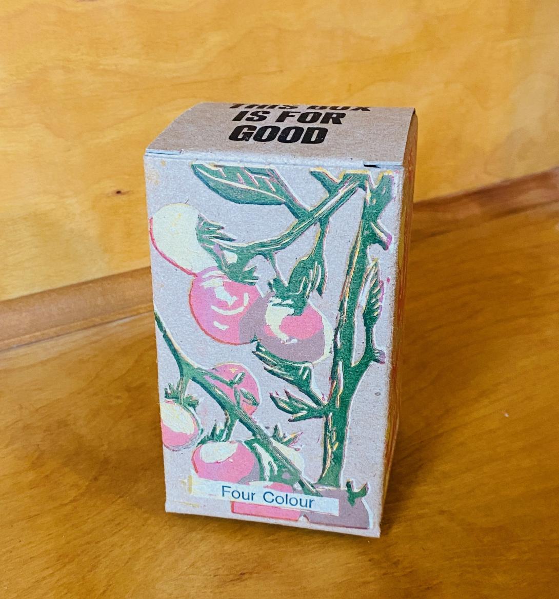
We are devoted supporters of Heart Beet Organics and their Charlottetown market and restaurant the Farmacy + Fermentary, and so Lisa reached out to them early in the year to see if they’d be interested in partnering on a spring box. They were eager, and, together with Amy and Verena, we arrived at the idea of a “tomato box,” containing heirloom cherry tomato seeds, sundried cherry tomatoes, and a jar of their smoked/roasted tomato salsa. And on the outside of the box? Tomatoes, of course.
The Tomatoes
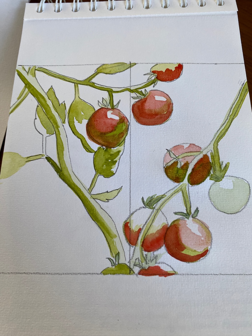
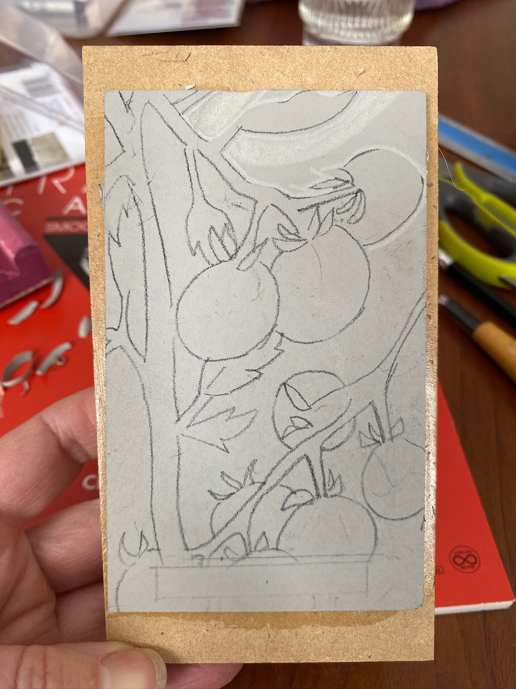
Lisa took a watercolour painting course over the winter, and used the opportunity to make some watercolour sketches and mockups of possible approaches. She used an image she found on Pinterest as a starting point (by artist Abigail Joiner).
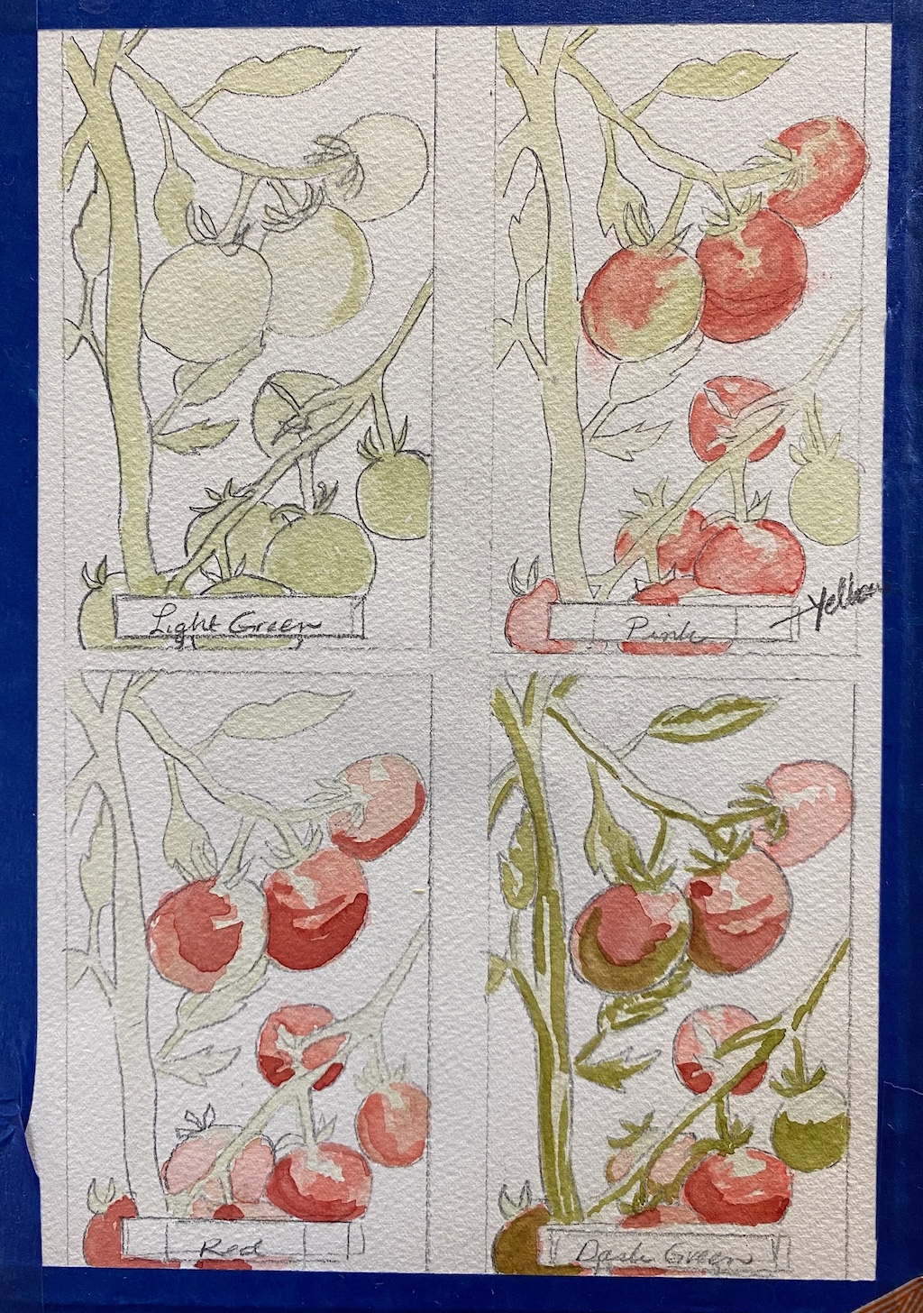
The idea was to, as we did in January, make a reduction linocut, allowing us to print multiple colours from the same block, carving more of the block away as we printed darker and darker colours.
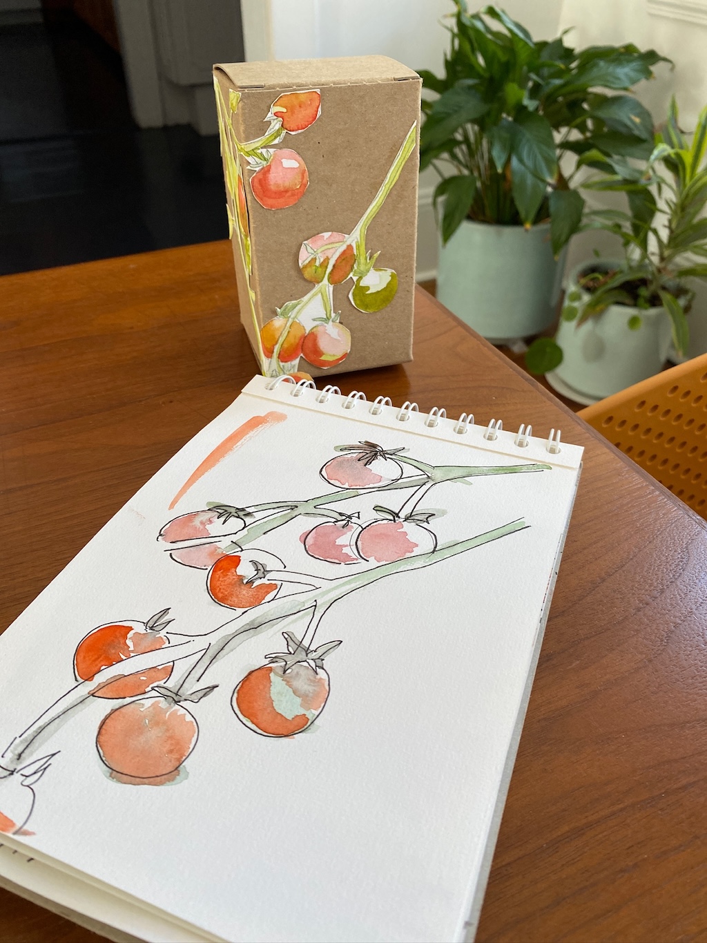
I suggested we use the opportunity to also demonstrate the process itself: rather than carving a single image that wrapped around the box, instead we’d print the same image on each side of the box, adding one additional colour per side. Lisa made a mockup of this process, in watercolour:
We both liked this idea, and so Lisa started the process of carving the mounted piece of 3” by 5” battleship linoleum in preparation for the first colour:
Printing Green
Our first step in the printing was to select a shade of light green to print the first layer. We mixed white with various amounts of green until we found the right shade:
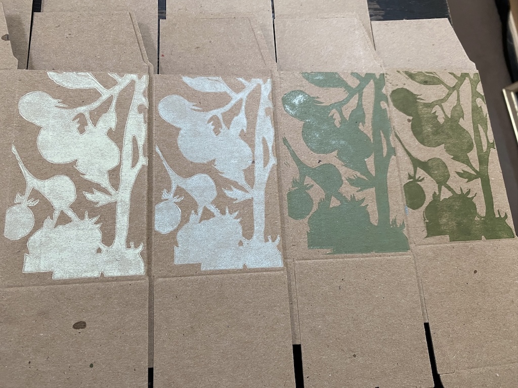
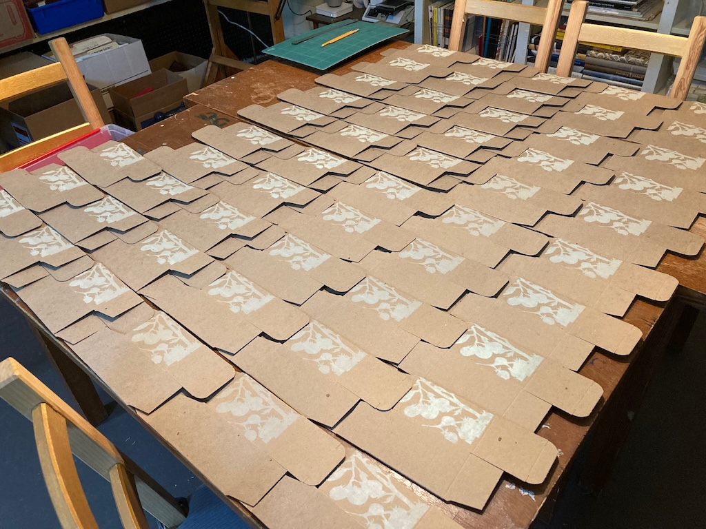
We set on the lightest (leftmost) shade of green to print with, and printed this single image on each of the four sides of the box, using the Golding Jobber No. 8 letterpress:
Registration Hell
Any time multiple colours are printed to form the same image, the colours must be registered against each other so that they print in the right place on the box. That the box is a clunky three dimensional object, that my right-left/up-down spacial sense is wonky, and that the whole registration process is just inherently fiddly means this is a time-consuming and often frustrating one.
The process, for this job, was made double frustrating because, due to an error on my part, we ended up printing half of the first run of boxes upside down. Technically there’s no right-side-up for the boxes — they work either end up. But I printed half the boxes one way, and half the boxes the other way, meaning the direction the addition of colours should go needed to be different for each half. It made an already fiddly situation even more so.
Adding Yellow
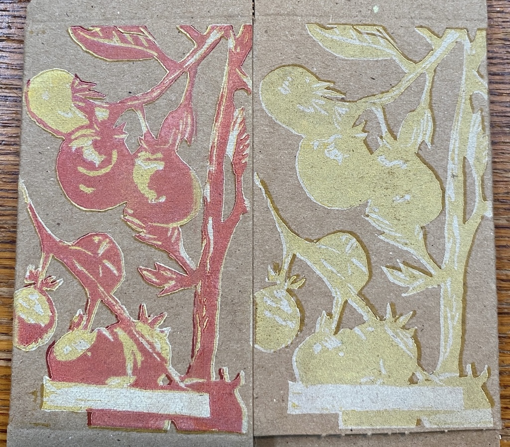
The next colour to print was light yellow. Because of our process of adding one colour per side of the box, we only needed to print yellow on three of the four sides.
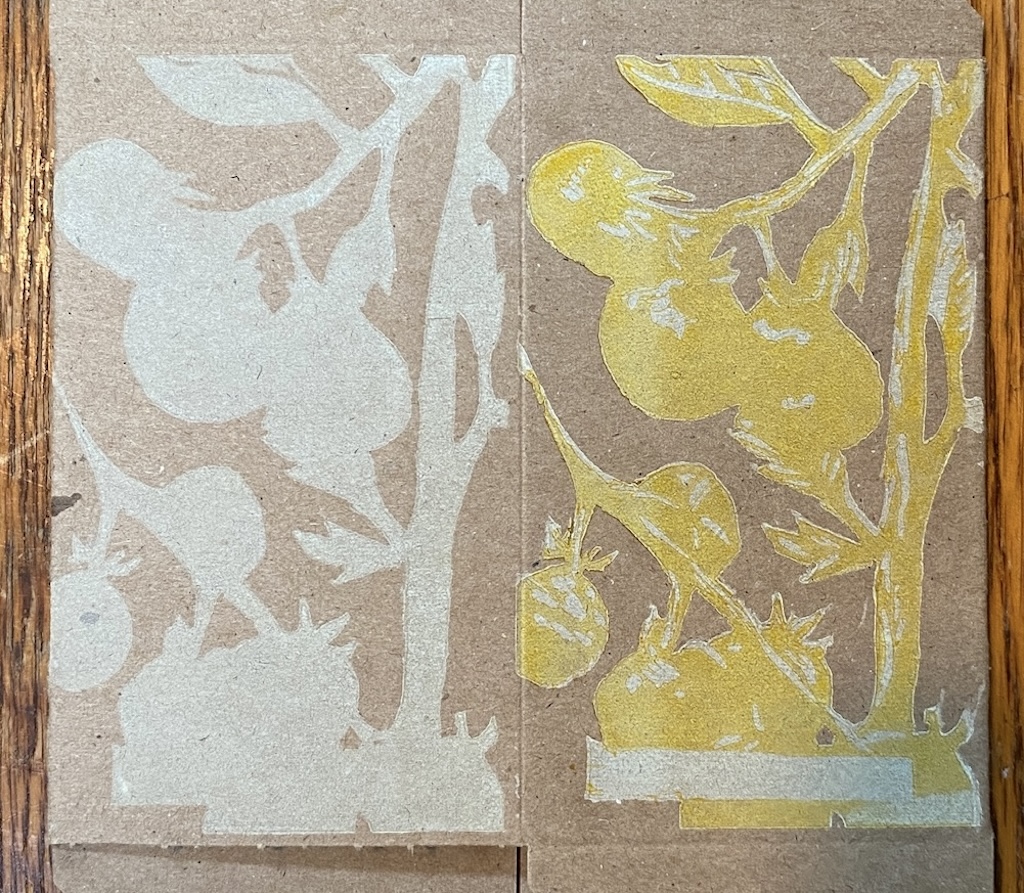
The way reduction lino works is that as you proceed through each colour, you carve away the areas you want to remain in the underlying colour. In the above, for example, Lisa carved away the areas she wanted to remain green and so those areas “show through” the overprinted yellow. Seeing this result, Lisa regretted not having left more light green as part of the design.
Adding Red
Red was the next colour to print (meaning that Lisa carved out the areas she wanted to remain yellow for this state). You can see, especially on the right side of this particular box, one of our registration challenges manifesting: the yellow printed over green looks wasn’t an exact overlay, resulting in edges printing directly over the brown cardboard and showing much darker.
We only needed to print red on two of the four sides. Each new colour made the printing process go a little faster (though registration issues ate into this savings).
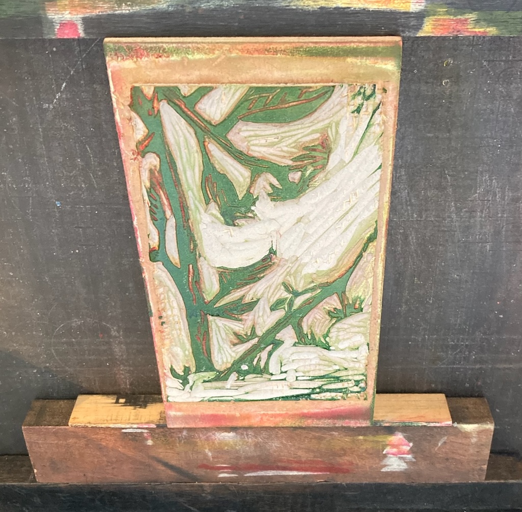
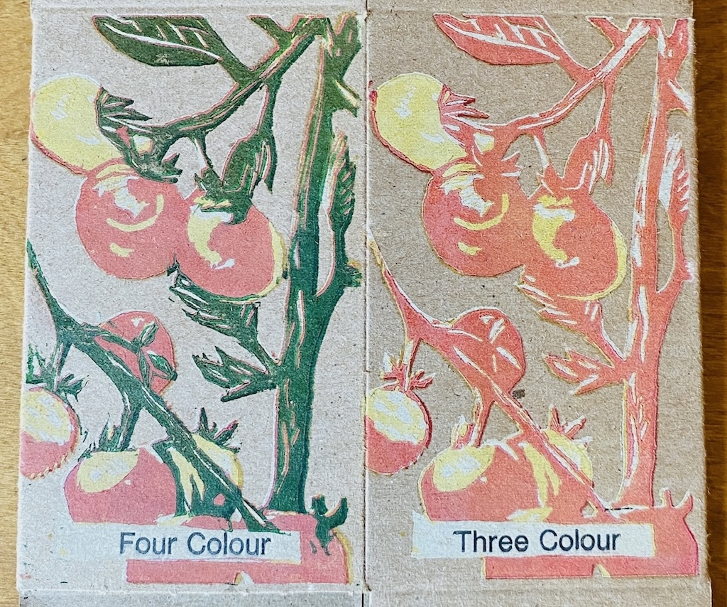
Adding Dark Green
When we went to add the dark green layer we ran into an unanticipated issue with how colours blend when they are overprinted: we printed straight dark green Akua intaglio ink over the underlayers of red, yellow, and light green and ended up with… brown. That’s because the inks aren’t opaque, and so the colours blend rather than simply overprint.
To work around this, we switch to using oil-based green letterpress ink, which is opaque (we got green by mixing blue and yellow, as there was no green oil-based ink in the shop). Here’s a photo for comparison, oil-based ink on the right, water-based ink on the right:
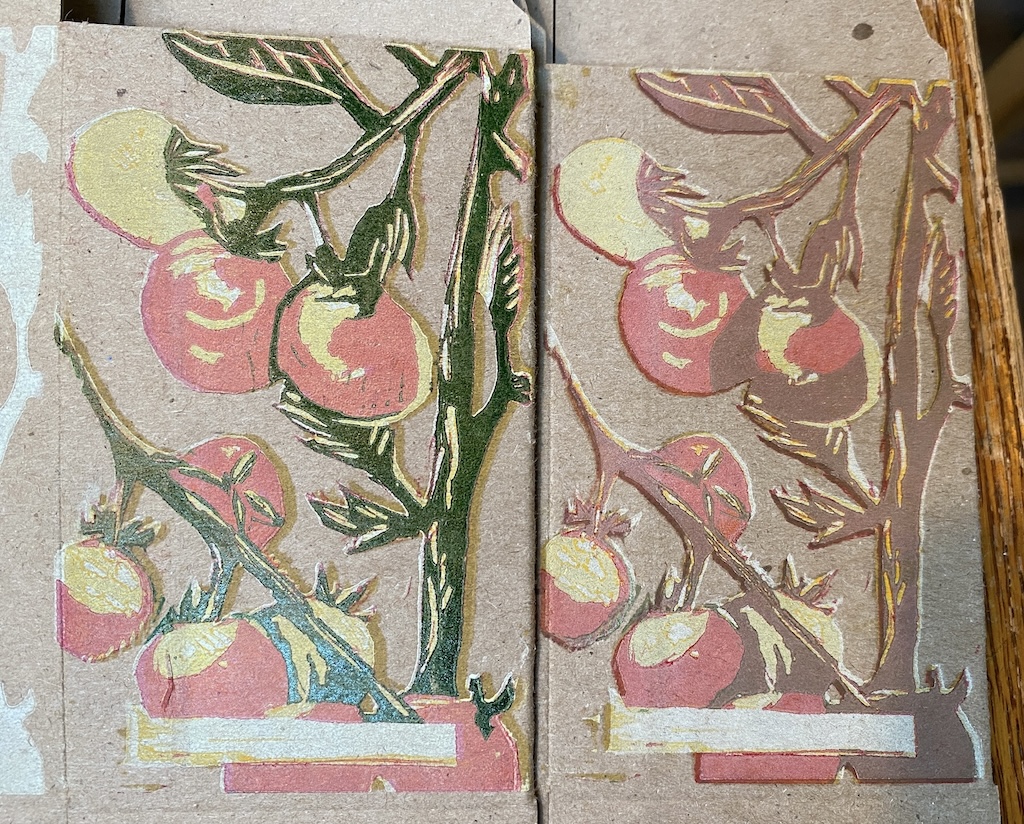
The lino block, at this point, had only the areas we wanted to print green left; everything Lisa wanted to leave red was carved away:
Adding Words
Lisa left a space in her design to label each side, and I added these labels, one side at a time, with metal type:
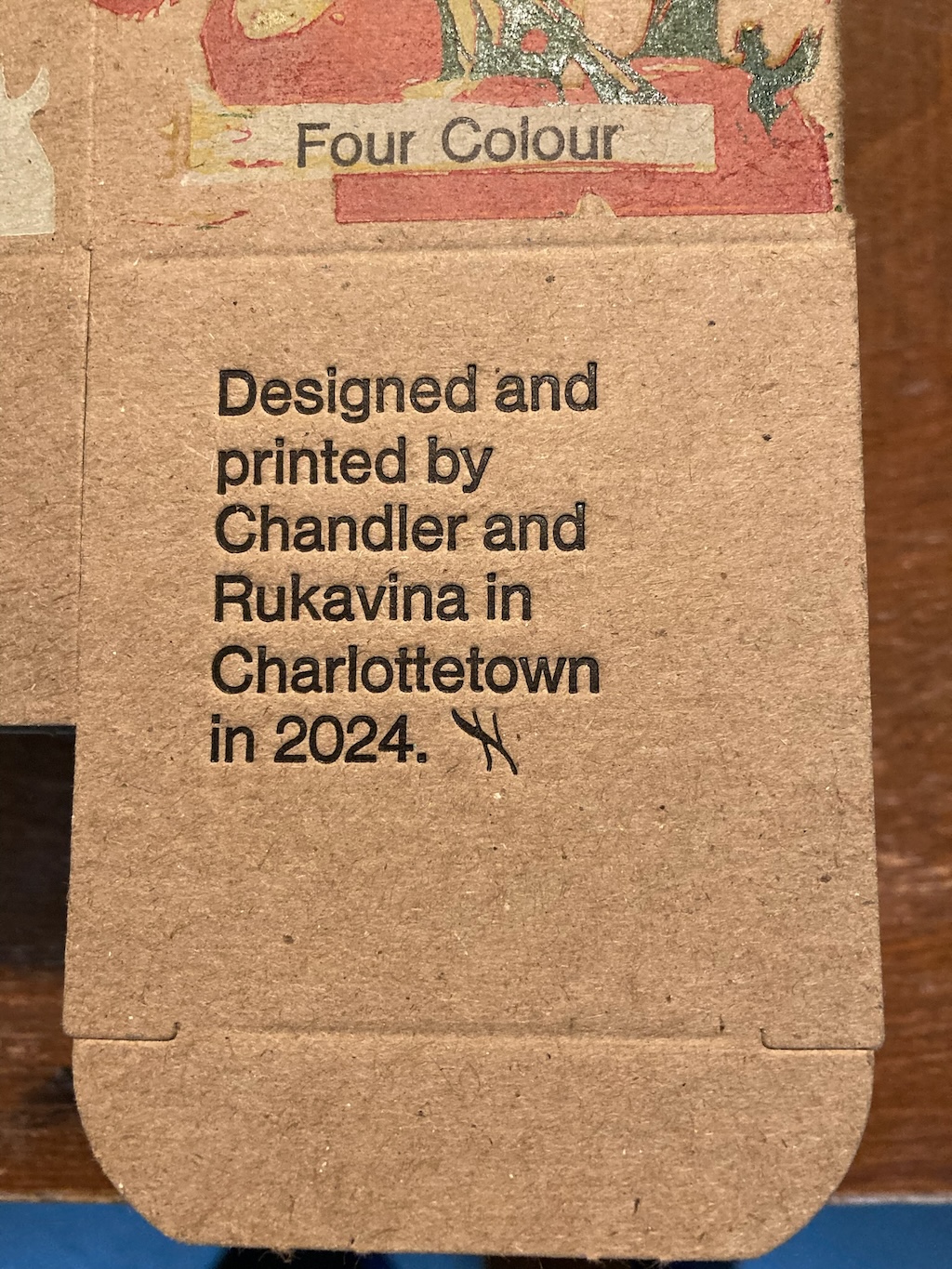
I added the “THIS BOX IS FOR GOOD” to the top flap, and printed the bottom flap with a credit line:
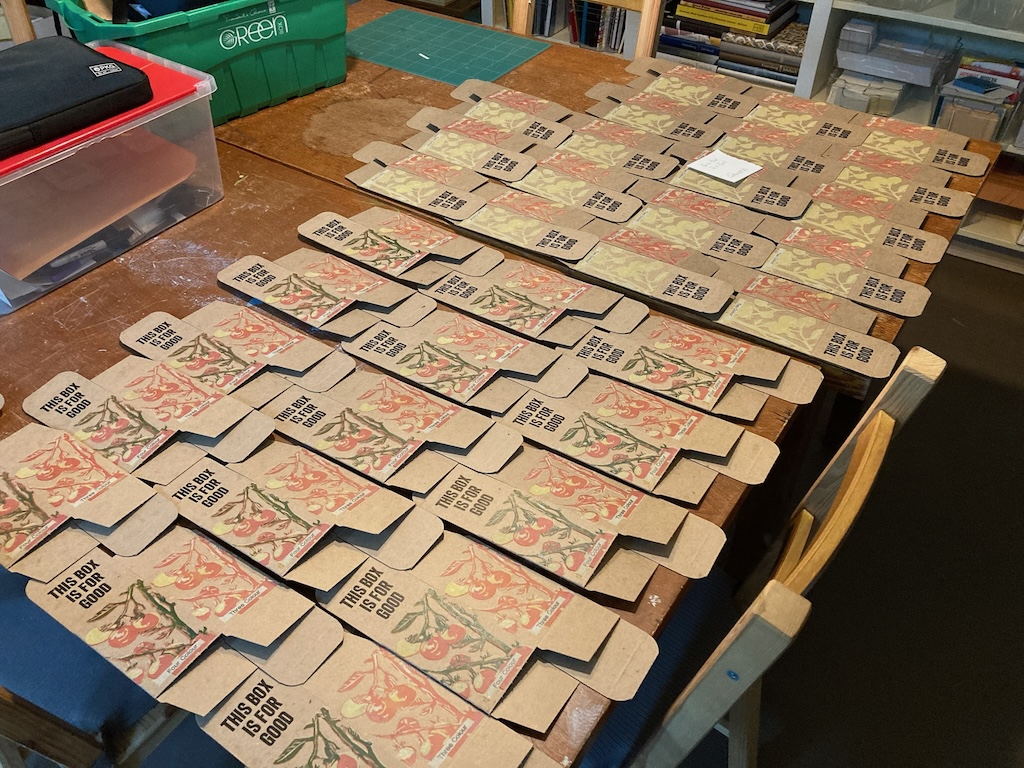
Put all together, the finished box looked like this:
Adding a Unique Number and Call to Action
The “social” part of our “creative social intervention” depends on box recipients registering and passing along their boxes to others, and explaining that, in a way that recipients understand—and act on—has been an evolving target.
For our January and February boxes, we printed a card for under the top flap that responded to the “This Box is for Good” on the top, “What good? Visit thisbox.info to find out more!” plus the number:
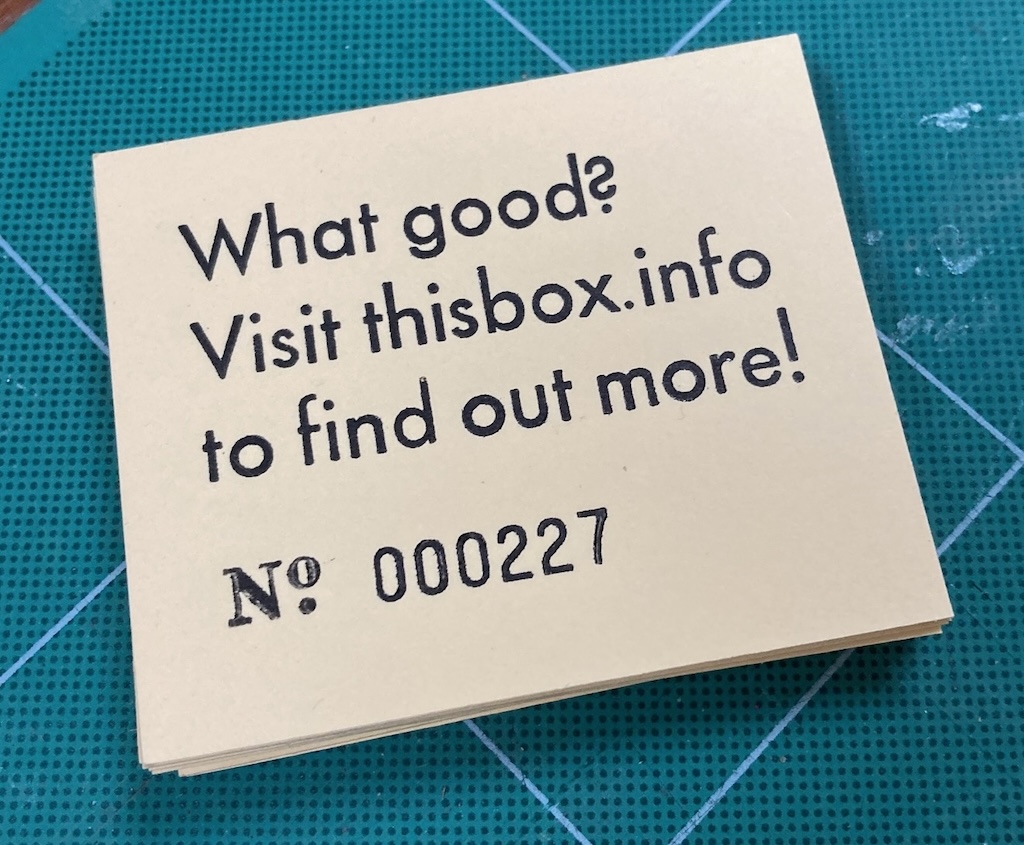
Of the 28 boxes we distributed in January, 10 were registered (36%); of the 28 boxes we distributed in February, 9 were registered (32%). We were eager to increase this rate, so we brainstormed a bunch of ideas for March:
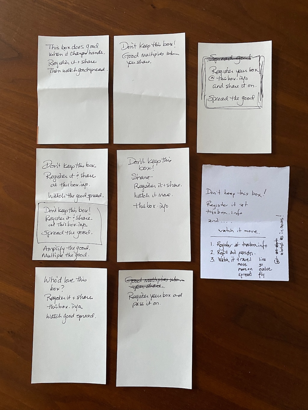
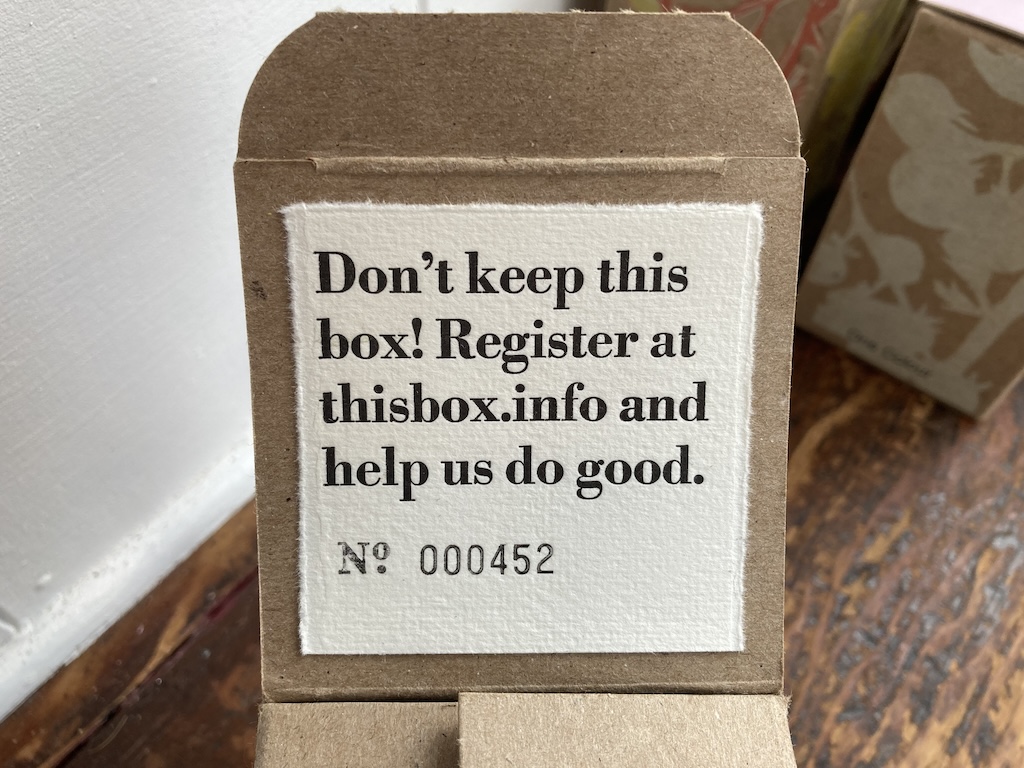
We settled on the bolder “Don’t keep this box! Register at thisbox.info and help us do good.”:
We’re hopeful that the purpose of the project is clear, and perhaps we’re just impatient; recipients may be simply taking their time to thoughtfully pass their boxes along.
Nonetheless, we continue to vacillate between trying to explain the entire idea on this card, and simply directing recipients to our website, and explaining it there. I expect we will continue to evolve this card in future months.
We glued the cards under the flaps of what ended up, after registration errors and other irregularities, an edition of 34 boxes (after starting with 60):
Filling the Boxes
The tomatoes! Last week we dropped by the Farmacy + Fermentary to pick up the box contents: packets of heirloom cherry tomato seeds, sundried cherry tomatoes, and bottles of smoked/roasted tomato salsa. We sat at the front table for a few hours, eating lunch—one of the bonus features of partnering with an excellent restaurant was the opportunity to integrate lunch out into our parter visits!—and labelling the packets.
One More Thing!
Remember Lisa’s watercolour course? With the generous cooperation of her teacher, Marion Copleston, Lisa gamely recruited her fellow students in an effort to contribute 3” by 5” note cards with tomato imagery, one each to be included in each box. They more than rose to the effort, and she brought home a lovely collection.
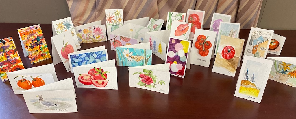
We slipped one card in each box, sealed everything up, and the boxes are on the way to a motley collection of friends, acquaintances, and strangers who requested a box.
What can you put in future boxes?
Another part of the social in “creative social intervention” is finding coconspirators to join us: maybe you’re one of them?
This isn’t a marketing opportunity. We aren’t influencers. The “good” that comes from collaborating with us will flow more outward than inward.
So we’re looking for people, businesses, organizations who are interesting in sharing their wares, their creativity, their ideas.
If this describes you, please let us know: send an email to hello@thisbox.info.