
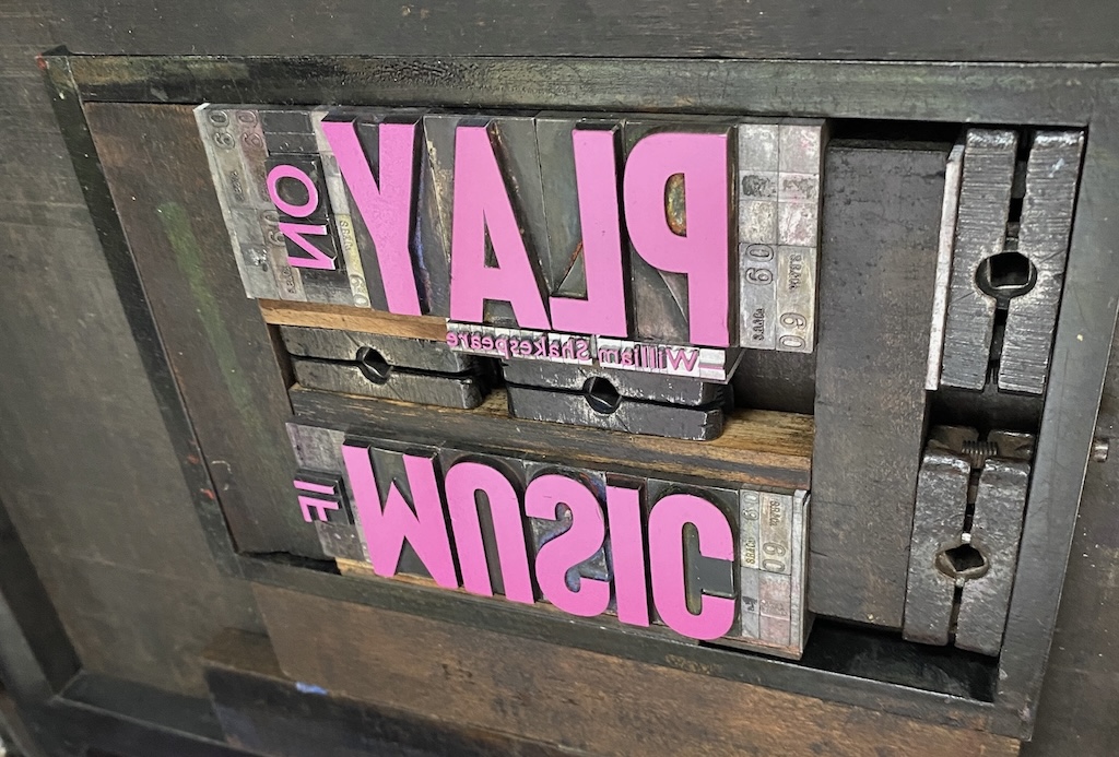
Our first and second boxes were printed with a combination of lino block printing for the “artistic” sides and metal type for the “workaday” top and bottom; the February box, though, was entirely letterpress-printed using metal type.
As Lisa wrote in her description of the January box, “building up these new colourful layers together has meant confronting our pasts and navigating many emotions.” Among these “many emotions” are those surrounding different expectations of schedule and pacing.
While it’s a gross generalization, I tend to be a “wander around for a long time and then, blam, do something” creator, whereas Lisa is much more organized and deliberate; she feels the emotional weight of commitments that I can blissfully ignore. These differences came into contrast for the February box: having agreed to take the creative lead, I dragged my feet on coming up with a concept, sitting firming in my “wander around” stance beyond its expiration date.
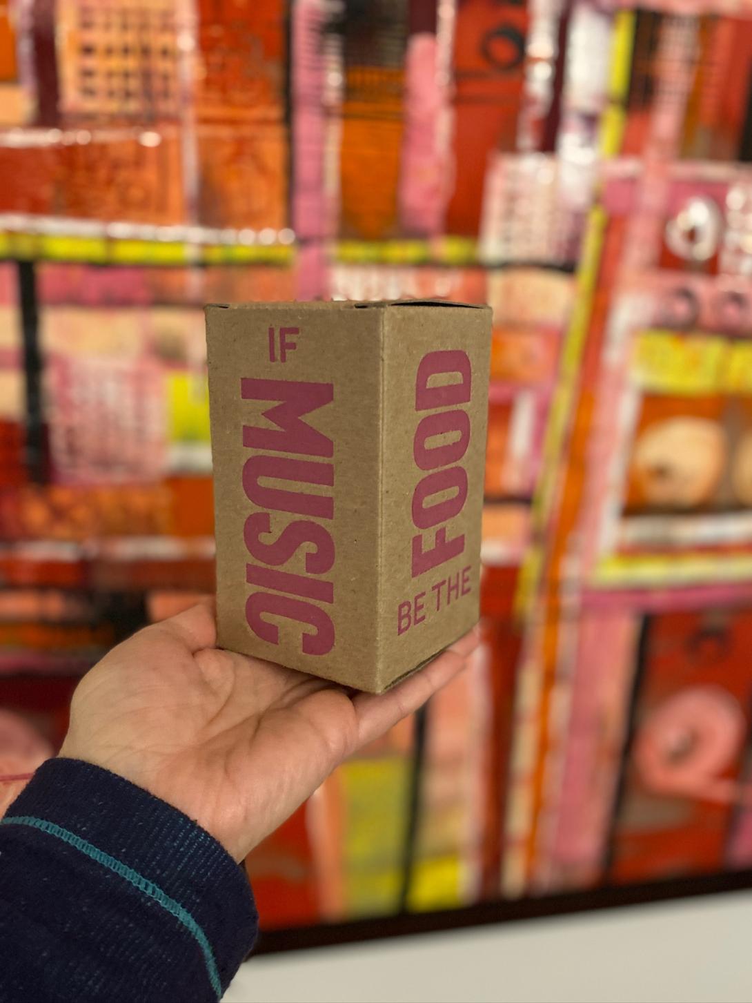
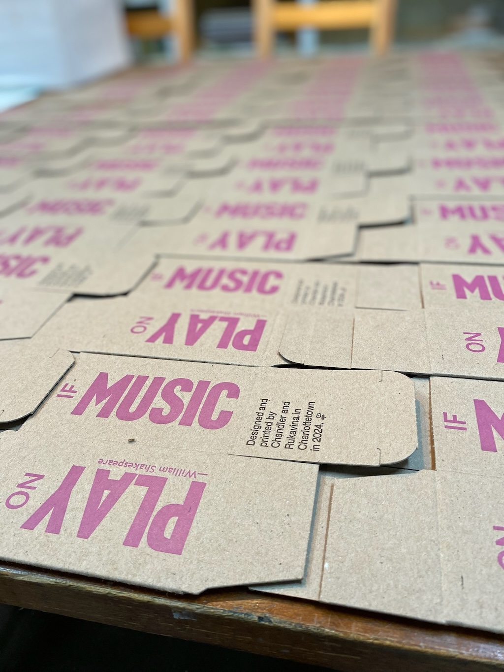
It’s not like I had no idea at all, as, very early on, the notion of using the passage from Skakespeare’s Twelfth Night, “If music be the food of love, play on” came to me. I experimented with different ways of wrapping this text around the box, but nothing worked. I wandered. And wandered some more.
Eventually, with Valentine’s Day approaching quickly—the inspiration for the passage—I was spurred to creative breakthrough, falling back to my metal type roots instead of trying to wrangle a lino block carving at the 11th hour:
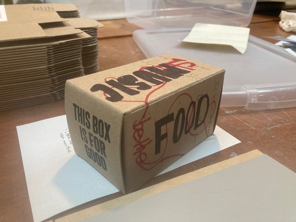
The idea was to break the passage across four sides of the box:
- If MUSIC
- be the FOOD
- of LOVE
- PLAY on
Somehow, while other attempts to split the passage over four sides failed in confusion, this approach worked. Lisa and I used proofs of the words printed on plain card stock and experimented with different arrangements, until something ultimately pleasing resulted:
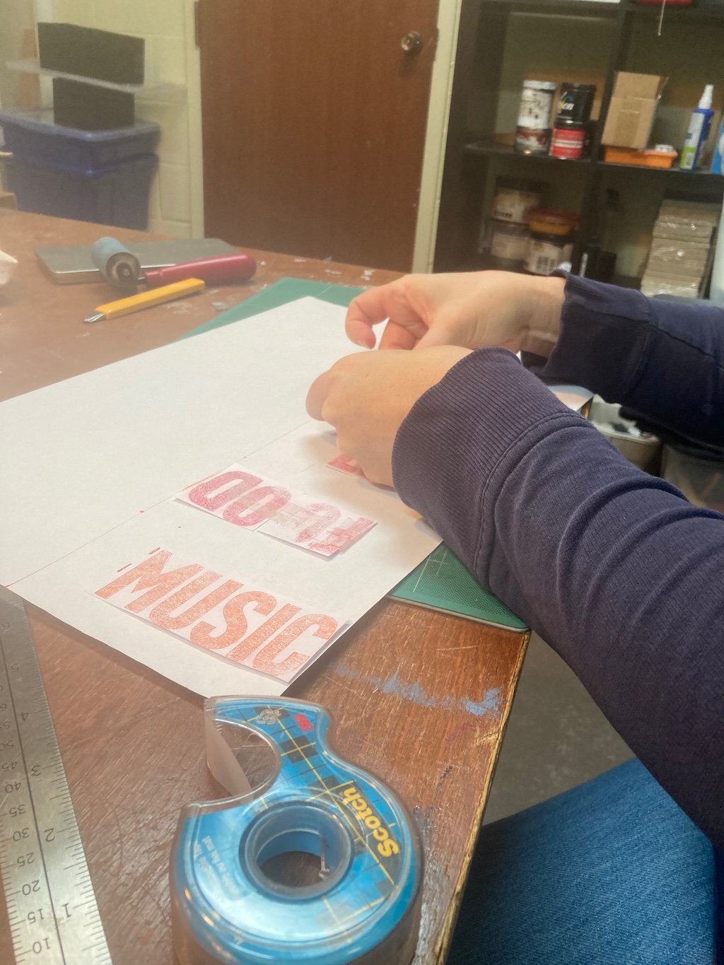
I set the type, two sides per lockup, a pleasantly complicated jigsaw puzzle to solve:
When it came time to print, Lisa came to the fore again, mixing a shade of pink that, despite being a colour I never could have, never would have, arrived at on my own, was perfectly suited to the task (see above, “building up these new colourful layers together”).
Printing in a single colour—pink for the sides, black for the top and bottom—meant we only needed to register once per side (the need to register many, many times for the reducation lino prints being the technical Achilles heel of both the January and March boxes)—and the February box, from that point, proceeded at a rapid pace.
Printing with rubber-based ink helped with the velocity too: it dries almost immediately on the thirsty boxboard, whereas the water-based Akua intaglio inks we’re using for lino blocks can take several days.
The boxes were ready to go just before Valentine’s Day.
Whereas our December and January boxes were filled with treats and gifted to family, friends, and aquaintances, we experimented with some new approaches for February. We gifted empty boxes to Red Island Cider, which took a dozen to distribute to subscription box customers; we guested on CBC Mainstreet to talk about the box project, and the show gave away five boxes to go along with CBC swag to listeners; we gave a few boxes out to members of our improv troupe. And, as before, we also filled some of the boxes with Fritz chocolates and gifted them to friends and familiars.
We’re curious to know how these different ways of distributing the boxes, departing from personally handing them to people we know, to and explaining the idea, will affect the level at which boxes do, indeed, get passed along and registered by others.
And, on our way to improv class on the eve of Valentines, we gave one to Rachel at The Cork & Cast, which she immediately set in a place of honour in the restaurant:
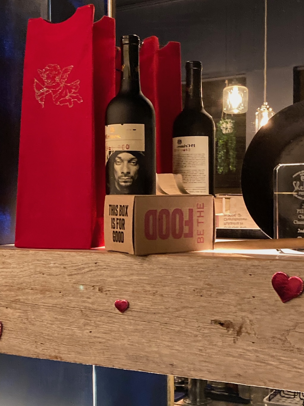
While we’re hopeful that Rachel will honour the spirit of the project and find someone to pass the refilled box along to, it’s a lovely place to have the work displayed for a bit.